CSS float ����
�� CSS �У�����ͨ�� float ����ʵ��Ԫ�صĸ�����
float��һЩʹ��
���Ͳ�����ʽ
Ч��ͼ���£�
�ο��������£�
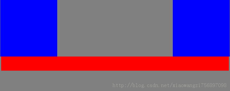
  <style>
     body
    {
       margin-left:0,100px;
     }
    div
	{
	  width:200px;
	  height:200px;
	  background:blue;
	}
    #left
	{
	  float:left;
	}
	#right
	{
	  float:right;
	}
	#footer
	{
	  margin:0 auto;
	  width:800px;
	  height:50px;
	  background:red;
	  clear:both;
	}
  </style>
 </head>
 <body bgcolor="gray">
     <div id="left"></div>
     <div id="right"></div>
     <div id="footer"></div>
 </body>
��ҳ����
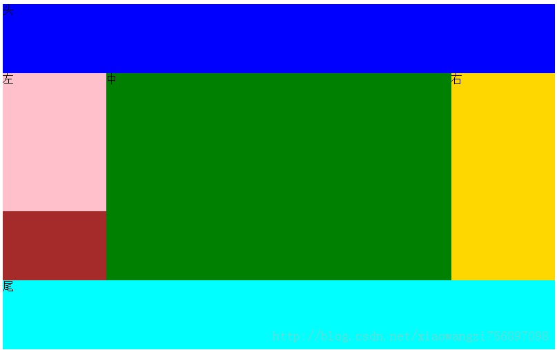
<style type="text/css">
#header,#main,#footer
{
width:800px;
margin:0 auto;
}
#header
{
height:100px;
background:blue;
}
#left,#mid,#right
{
height:300px;
float:left;
}
#left,#right
{
width:150px;
}
#left
{
height:200px;
background:pink;
}
#mid
{
width:500px;
background:green;
}
#right
{
background:gold;
}
#main
{
background:brown;
}
#footer
{
clear:both;
height:100px;
background:aqua;
}
.clear
{
clear:both;
}
</style>
</head>
<body>
<div id="header">ͷ</div>
<div id="main">
<div id="left">��</div>
<div id="mid">��</div>
<div id="right">��</div>
<div class="clear"></div>
</div>
<div id="footer">β</div>
</body>
css ��һЩע������
����һ�����и��飬�����и�����������û�����ø߶�ʱ�����ܻ���ָ����ijЩ���ò���Ч����background��
����취����ȥ��������Ӱ�졣����������
��1�� ͨ���ڸ��������ĺ��棬��һ����<div class="clear"></div> ��������ʽ.clear
{
clear:both; //w3c�Ƽ�
}
��2�����ø������ʽ
overflow��hidden; ������������������⣬����ie6û��Ч�������ǻ���Ҫ����һ������zoom��1���������ie6��css����������
��3�����ø����һ������
<style type="text/css">
#header,#main,#footer
{
width:800px;
margin:0 auto;
}
#header
{
height:100px;
background:blue;
}
#left,#mid,#right
{
height:300px;
float:left;
}
#left,#right
{
width:150px;
}
#left
{
height:200px;
background:pink;
}
#mid
{
width:500px;
background:green;
}
#right
{
background:gold;
}
#main
{
background:brown;
}
#footer
{
clear:both;
height:100px;
background:aqua;
}
.clearFix:after
{
clear:both;
height:0;
display:block;
line-height:0;
visibility:hidden;
content:"";
}
.clearFix
{
zoom:1;
}
#zoom
{
width:1000px;
height:1000px;
background:blue;
zoom:0.1;
}
</style>
</head>
<body>
<div id="header">ͷ</div>
<div id="main" class="clearFix">
<div id="left">��</div>
<div id="mid">��</div>
<div id="right">��</div>
</div>
<div id="footer">β</div>
<div id="zoom"></div>
</body>
���ַ������Ƚϳ��á�
����float��ijЩ��������滹�����һЩ�ر��Ч��
����ie6��������margin��float �ͻ����˫����margin�߾࣬�������������div��������һ��display:inline;
<style type="text/css">
body,div
{
margin:0;
padding:0;
}
div
{
width:200px;
height:200px;
background:gold;
margin:0 0 0 100px;
float:left;
display:inline;//������������˫���߾��
}
</style>
</head>
<body bgcolor="gray">
<div></div>
</body>
css������
css����ʵ�� ����ͨ����£���ʾ��¼������ƶ���ʱ����ʾע��Ч����
��Ҫ��һ�� ������ͼƬ��������
��������<style> #last a{ width:102px; height:42px; background-image:url('img/2013-10-08_154717.png') ; display:block; //border:1px solid red; } #last a:hover//� { background-position:102px -42px; } </style> <body> <div id="last"> <a href="#"></a> </div> </body>
���Զ�λ��ʹ��
��Բ��֣�ij���������ó���Բ��֣����������λ�ò��ᱻ�������Ԫ��ռ�ݣ����λ�û��ɿհ�
���Բ��֣�ij���������óɾ��Բ��֣����������λ�ûᱻ�������Ԫ��ռ�ݡ�
Ҫʵ�����µ�Ч��
���������˾��Բ��֣�������Ҫ���ó���Բ��֣������ڸ���������ʾ�����Ч����
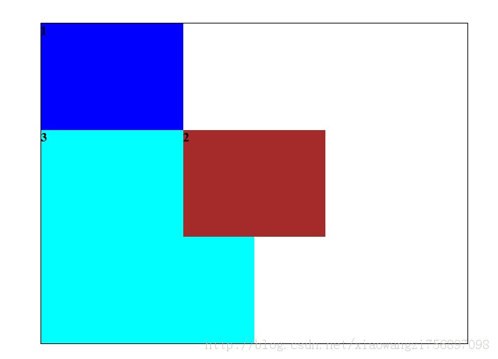
<style type="text/css">
body
{
margin:0;
padding:0;
}
#header,#main
{
width:200px;
height:150px;
}
#header
{
background:blue;
}
#main
{
position:absolute;//���������˾��Բ���
top:150px;
left:200px;
background:brown;
}
#footer
    {
	    background:aqua;
	    width:300px;
	    height:300px;
}
#all
{
width:600px;
height:450px;
margin:200px auto;
border:1px solid;
position:relative;//������Ҫ�������
font-size:18px;
font-weight: bold;
}
</style>
</head>
<body>
<div id="all">
<div id="header">1</div>
<div id="main">
2
</div>
<div id="footer">3</div>
</div>
</body>