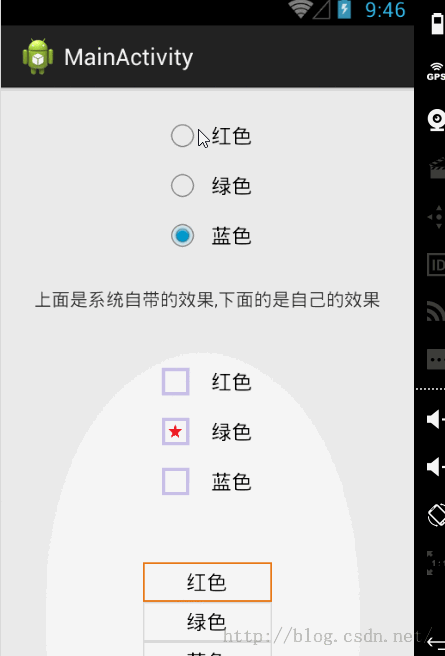
效果图:
对radiobutton的样式自定义无非就是style,在style里面有background来设置radiobutton的背景 button来设置radiobutton的小框框,当为null的时候,就是不要框框了
自定义的第一种style:
<style name="CustomRadioBtn"> <item name="android:button">@drawable/mycustome_radio_selctor</item> </style>
mycustome_radio_selctor xml的代码:
<?xml version="1.0" encoding="utf-8"?><selector xmlns:android="http://schemas.android.com/apk/res/android"> <item android:drawable="@drawable/enable_on_pressed" android:state_checked="true" android:state_enabled="true" android:state_pressed="true"/> <item android:drawable="@drawable/enable_off_pressed" android:state_checked="false" android:state_enabled="true" android:state_pressed="true"/> <item android:drawable="@drawable/enable_on" android:state_checked="true" android:state_enabled="true"/> <item android:drawable="@drawable/enable_off" android:state_checked="false" android:state_enabled="true"/> <item android:drawable="@drawable/disabled_on" android:state_checked="true" android:state_enabled="false"/> <item android:drawable="@drawable/disabled_off" android:state_checked="false" android:state_enabled="false"/></selector>
第二种自定义样式style:
<style name="CustomRadioBtn2"> <item name="android:gravity">center</item> <item name="android:background">@drawable/rb_nobtn_selector</item> <item name="android:button">@null</item> </style>
rb_nobtn_selector xml:
<?xml version="1.0" encoding="utf-8"?><selector xmlns:android="http://schemas.android.com/apk/res/android"> <item android:drawable="@drawable/rb_pressed_bg" android:state_checked="true"></item> <item android:drawable="@drawable/rb_normal_bg" android:state_checked="false"></item></selector>
只需要关注state_checked的状态就行了
这样效果就实现了.图片最好用.9图,gravity设置center就好
版权声明:本文为博主原创文章,未经博主允许不得转载。