1.目标及知识点:
- css3 transition 使用
- css3 animation 使用
- css3 transform 使用
- 利用CSS3 transition 实现动画 - transition 语法详解- transition-delay- transition-duration- transition-property- transition-timing-function- 贝塞尔曲线运动 https://cubic-bezier.com/- transition 针对为渲染元素的问题 - transitionend 事件
- 利用CSS3 animation 动画- keyframes- animation-name- animation-duration- animation-timing-function,- animation-delay- animation-iteration-count- animation-direction - animation-fill-mode- animation 相关事件- animationstart- animationiteration - animationend
- CSS3 transform 详解- transform 2D- 旋转: rotate()- 缩放: scale()、scaleX()、scaleY()- 倾斜: skew()、skewX()、skewY()- 平移:translate()、translateX()、translateY()- transform 多函数书写时的执行顺序- transform-origin 源点设置- translate 和 源点关系- transform 3D - 3D旋转: rotateX()、rotateY()、rotateZ()- 3D位移:translateZ()- transform-style- perspective- perspective-origin- 搭建立方体
- CSS3 transform 详解- transform 2D- 旋转: rotate()- 缩放: scale()、scaleX()、scaleY()- 倾斜: skew()、skewX()、skewY()- 位移:translate()、translateX()、translateY()- transform 多函数书写时的执行顺序- transform-origin 源点设置- translate 和 源点关系- 实例:无缝滚动- 实例:水滴按钮- 实例:时钟实现- 扩展:JS 获取 transform 的问题- matrix(a,b,c,d,e,f) 矩阵函数- matrix(1,0,0,1,0,0);- 通过矩阵实现缩放- x轴缩放 a=x*a c=x*c e=x*e;- y轴缩放 b=y*b d=y*d f=y*f;- 通过矩阵实现位移- x轴位移: e=e+x- y轴位移: f=f+y- 通过矩阵实现倾斜- x轴倾斜: c=Math.tan(xDeg/180*Math.PI)- y轴倾斜: b=Math.tan(yDeg/180*Math.PI)- 通过矩阵实现旋转- a=Math.cos(deg/180*Math.PI); - b=Math.sin(deg/180*Math.PI);- c=-Math.sin(deg/180*Math.PI);- d=Math.cos(deg/180*Math.PI);- transform 3D - 3D旋转: rotateX()、rotateY()、rotateZ()- 3D位移:translateZ()- transform-style- perspective- perspective-origin- 搭建立方体2.transition
2.1 transition作用及样式:
transition作用:
transition 在元素的样式发生改变时,给元素添加一个过渡动画。不是所有样式都有效果,必须是宽高,背景色,距离,位置等数值类样式才有效果。通过css和JS改变都会有动画效果。
transition样式:
- transition-delay:延迟时间,动画延迟多长时间执行(s|ms),默认为0。可选
- transition-duration:动画时长,动画用多长时间完成(s|ms),默认为0,必填
- transition-property:要动画的样式。默认all。只给某些加样式如,transition:1s width;只给宽加过渡动画
- transition-timing-function:动画形式
transition-timing-function动画形式:
- linear 匀速
- ease 缓冲(默认值)
- ease-in 加速
- ease-out 减速
- ease-in-out 先加速再减速
- cubic-bezier()贝塞尔曲线
各个样式之间不加逗号。除非给宽高分别加样式:如,transition:1s width,.5s height;
<!DOCTYPE html>
<html lang="en">
<head><meta charset="UTF-8"><meta name="viewport" content="width=device-width, initial-scale=1.0"><meta http-equiv="X-UA-Compatible" content="ie=edge"><title>Document</title><style>div {width: 100px;height: 100px;background: red;}.hover {width: 400px;height: 200px;background: blue;/* transition: .5s;transition-delay动画延迟多长时间执行 *//* transition: .5s 1s; transition-duration动画用多长时间完成 *//* transition: .5s 1s width; transition-property:要动画的样式,默认all是给所有样式加过渡效果*//* transition: 1s .5s width ease-in-out;  *//*transition-timing-function:动画形式:linear 匀速ease 缓冲(默认值)ease-in 加速ease-out 减速ease-in-out 先加速再减速cubic-bezier()贝塞尔曲线 https://cubic-bezier.com/*/transition: 1s .5s width cubic-bezier(0,1.42,.83,.67);}</style>
</head>
<body><div></div><script>//设置鼠标移入移出事件,然后加上transition效果var div = document.querySelector("div");div.onmouseover = function(){this.classList.add("hover");};div.onmouseout = function(){this.classList.remove("hover");};</script>
</body>
</html>
2.2 transition使用时注意点:
默认隐藏的元素,设置点击后再显示时,过渡动画会失效。
解决:定时器延时过渡动画执行
需求:默认div隐藏,点击按钮后再显示并设置过渡后效果
<!DOCTYPE html>
<html lang="en">
<head><meta charset="UTF-8"><meta name="viewport" content="width=device-width, initial-scale=1.0"><meta http-equiv="X-UA-Compatible" content="ie=edge"><title>Document</title><style>#box {width: 100px;height: 100px;background: red;display: none;transition: .5s;}</style>
</head>
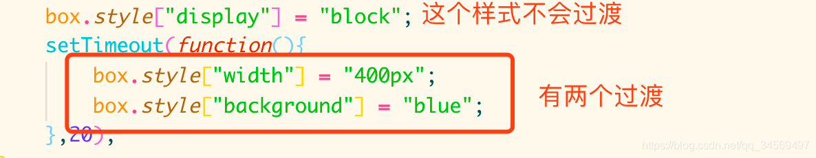
<body><div id="box"></div><button>显示</button><script>//元素本身是隐藏的,点击时设置block,并改变其宽度,设置动画过渡效果//延时最好不低于20:因为屏幕有渲染帧频问题,1s渲染60次,16.7ms渲染一次。如果写0可能卡在上一屏,动画过渡效果就可能出不来var box = document.querySelector("#box");var btn = document.querySelector("button");btn.onclick = function(){box.style["display"] = "block";box.style["width"] = "400px";box.style["background"] = "blue";// setTimeout(function(){// box.style["width"] = "400px";// box.style["background"] = "blue";// },20);};</script>
</body>
</html>问题:发现此时并没有动画过渡效果。
原因:元素本身设置display为none是不会渲染这个元素的,当display设置为block时,才开始渲染这个元素。而元素在页面渲染完(display设置为block)之前,transition是不起效果的。即屏幕绘制(display设置为block)需要时间,当display设置为block时,这个元素渲染需要时间,而代码之间执行的速度很快,所以会直接执行下面设置的宽高等样式,而不会通过transition动画去执行,所以,动画效果没有执行,屏幕已经渲染完了。
解决:需要在事件里,给元素的改变加上定时器延时。时间至少20ms
setTimeout(function(){box.style["width"] = "400px";box.style["background"] = "blue";},20);2.3 监听transition执行结束的事件:
- transitionend事件:监听元素的transition动画是否执行完毕
- WebKitTransitionEnd:低版本WebKit内核需要写成WebKitTransitionEnd
直接使用监听事件ontransitionend会监听不到transition执行结束:
<!DOCTYPE html>
<html lang="en">
<head><meta charset="UTF-8"><meta name="viewport" content="width=device-width, initial-scale=1.0"><meta http-equiv="X-UA-Compatible" content="ie=edge"><title>Document</title><style>#box {width: 100px;height: 100px;background: red;display: none;transition: .5s;}</style>
</head>
<body><div id="box"></div><button>显示</button><script>var box = document.querySelector("#box");var btn = document.querySelector("button");//如果元素事先隐藏,会监听到两次btn.onclick = function(){box.style["display"] = "block";setTimeout(function(){box.style["width"] = "400px";box.style["background"] = "blue";},20);};//监听事件ontransitionend方法没有效果btn.ontransitionend = function(){console.log("ontransitionend执行完成");//不会进行打印(没有监听到)};//监听transition执行结束事件transitionendbox.addEventListener('transitionend',function(){console.log("addEventListener transitionend执行完成");});</script>
</body>
</html>
结果:ontransitionend没有监听并打印结果,通过事件监听正确监听到结果
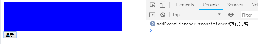
注意:每个样式都是独立的过渡效果,而不是整体进行一次性进行过渡,所以设置了多个过渡效果,事件监听也就会监听到多少次,所以这里打印了两次。
2.4 取消监听事件:
注意:
- 如果要取消监听事件,则添加监听事件时不能使用匿名函数,而需要写成有名函数
- 取消监听事件必须写在有名函数函数体内
<!DOCTYPE html>
<html lang="en">
<head><meta charset="UTF-8"><meta name="viewport" content="width=device-width, initial-scale=1.0"><meta http-equiv="X-UA-Compatible" content="ie=edge"><title>Document</title><style>#box {width: 100px;height: 100px;background: red;transition: .5s;}</style>
</head>
<body><div id="box"></div><script>var box = document.querySelector("#box");//给box添加click监听事件,并给box width+200,然后监听结束后,取消监听box.addEventListener('click',fn);boxWidth = parseInt(getComputedStyle(box)["width"]);function fn(){boxWidth += boxWidth;box.style["width"] = boxWidth + 'px';//监听事件结束后,取消监听事件(注意必须写在监听的函数中)box.removeEventListener('click',fn);}</script>
</body>
</html>
2.4 使用监听事件好处
通过onXXX写事件时,多个onXXX事件前一个事件处理会被覆盖。但是通过添加事件监听方式,可以添加多个事件处理。
var box = document.querySelector("#box");//给box添加click监听事件,并给box width+200,然后监听结束后,取消监听box.addEventListener('click',fn);box.addEventListener('click',function(){console.log("click事件2");});boxWidth = parseInt(getComputedStyle(box)["width"]);function fn(){boxWidth += boxWidth;box.style["width"] = boxWidth + 'px';//监听事件结束后,取消监听事件(注意必须写在监听的函数中)box.removeEventListener('click',fn);}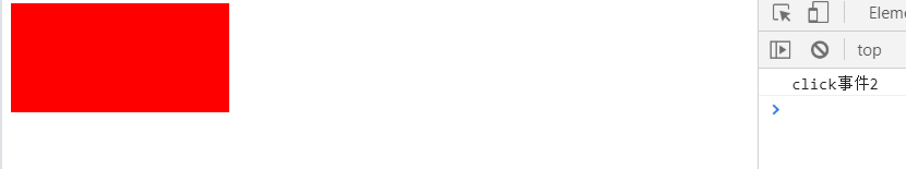
2.animation
2.1 transition作用及样式
transition作用及样式:
transition只能做一些简单的动画,如果要做一些复杂的动画就得使用animation。而且如果希望元素一开始就有动画,就要使用animation。animation使用时必须声明关键帧@keyframes 名字
- animation-name:动画帧名称 使用@keyframes 名字 进行定义 必选
- animation-duration :动画持续时间 必选
- animation-timing-function : 动画形式(参考transition)
- animation-delay : 动画开始前的延迟时间
- animation-iteration-count 动画执行次数 number | infinite(无限次)
- animation-direction : 偶数次动画执行过程 alternate(倒序执行) | normal (顺序执行)
- animation-fill-mode : backwards动画开始前元素的样式(保留在动画帧0%);forwards动画结束后,元素样式保留在动画帧0的100%的位置;both 动画开始前和结束后样式保留在动画帧0%和100%的位置,即backwards+forwards
- animation-play-state : 鼠标移入后hover,动画暂停(paused)| 继续播放(running)
#box:hover {
animation-play-state:paused;
}
animation使用注意点:
- animation是基于关键帧@keyframes 名字实现;
- 如果0%不写就默认使用计算后样式,可以对其进行重新定义;
- 如果中间xx%不写就没有对应的过渡效果;
- 如果100%不写就默认使用计算后样式,可以对其进行重新定义;
- 动画执行完后,又会回到计算后样式;
- 加animation-fill-mode就能改变动画执行完前/后保留的样式。而不是默认0%/100%
- 如果使用from{} to{} to{}会自动计算百分比进行渲染;
- 关键帧声明好后,需要进行调用animation: move 1s;
- 兼容老版本Chrome,必须加前缀-webkit-animation
- animation-play-state必须用在鼠标移入事件中,否则会导致整个动画暂停
简单示例:
<!DOCTYPE html>
<html lang="en">
<head><meta charset="UTF-8"><meta name="viewport" content="width=device-width, initial-scale=1.0"><meta http-equiv="X-UA-Compatible" content="ie=edge"><title>Document</title><style>/* animation是基于动画帧实现 */@keyframes move{/* 如果0%不写就默认使用计算后样式,可以对其进行重新定义 */0%{width: 0;height: 0;}25%{width: 100px;height: 150px;}50%{width: 150px;height: 300px;}75%{width: 300px;height: 100px;}/* 如果100%不写就默认使用计算后样式,可以对其进行重新定义,但是动画执行完后,又会回到计算后样式 */100%{width: 0;height: 0;}/* 如果使用from{}  to{} to{}会自动计算百分比进行渲染 */}#box {width: 100px;height: 100px;background: red;/* 动画帧的调用 *//* animation: move 1s infinite; 执行无限次*//* animation: move 1s 4; 执行指定次数 *//* animation: move 1s infinite alternate; 倒序执行(必须多次执行才有效) *//* animation: move 1s infinite normal; 顺序执行 */animation: move 1s linear; animation-fill-mode: both;/* 动画开始和结束后,元素样式保留在动画帧的0%和100% */}#box:hover {animation-play-state:paused;}</style>
</head>
<body><div id="box"></div>
</body>
</html>
from{} to{} to{} 实现动画效果:
<!DOCTYPE html>
<html lang="en">
<head><meta charset="UTF-8"><meta name="viewport" content="width=device-width, initial-scale=1.0"><meta http-equiv="X-UA-Compatible" content="ie=edge"><title>Document</title><style>@keyframes move{from {width: 100px;height: 100px;}to {width: 100px;height: 100px;}to {width: 200px;height: 100px;}to {width: 300px;height: 100px;}to {width: 400px;height: 100px;}}#box {width: 100px;height: 100px;background: red;animation: move 2s 4;animation-fill-mode: both; }#box:hover {animation-play-state:paused;}</style>
</head>
<body><div id="box"></div>
</body>
</html>
2.2 animation三个事件监听:
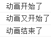
- animationstart(动画开始:第一次执行时监听到)
- animationend(动画结束)
- animationiteration(动画多次执行时使用,监听动画再次执行)
必须使用事件监听加这三个事件,而不能直接使用onXXX;
<!DOCTYPE html>
<html lang="en">
<head><meta charset="UTF-8"><meta name="viewport" content="width=device-width, initial-scale=1.0"><meta http-equiv="X-UA-Compatible" content="ie=edge"><title>Document</title><style>/* animation是基于动画帧实现 */@keyframes move{0%{width: 0;height: 0;}25%{width: 150px;height: 100px;}50%{width: 300px;height: 100px;}75%{width: 150px;height: 100px;}100%{width: 0;height: 0;}}#box {width: 100px;height: 100px;background: red;animation: move 2s linear 6; animation-fill-mode: both;}#box:hover {animation-play-state:paused;}</style>
</head>
<body><div id="box"></div><script>var box = document.querySelector("#box");box.addEventListener("animationstart",function(){console.log("动画开始了");});box.addEventListener("animationend",function(){console.log("动画结束了");});box.addEventListener("animationstart",function(){console.log("动画又开始了");});</script>
</body>
</html>
结果:
3.transform 2D
transform需要和transition或者animation一起使用才有过渡效果。
transform本身不脱离文档流,进行任何改变对其他元素都没有任何影响。
transform变换:
- 旋转:rotate() 单位:deg(角度,可为正负)。也有弧度,旋转几圈等单位,但用得比较少。
- 斜切:三个方法skew(x,y) skewX() skewY() 单位:deg(角度)
- 缩放:三个方法scale(x,y) scaleX() scaleY() 本身没有单位,只有倍数
- 位移:三个方法translate(x,y) translateX() translateY(),单位像素或其他
transform为了方便我们使用,将其所有的功能已经封装成对应的方法。
3.1 transform旋转rotate(deg):
transition实现transform的旋转:
<!DOCTYPE html>
<html lang="en">
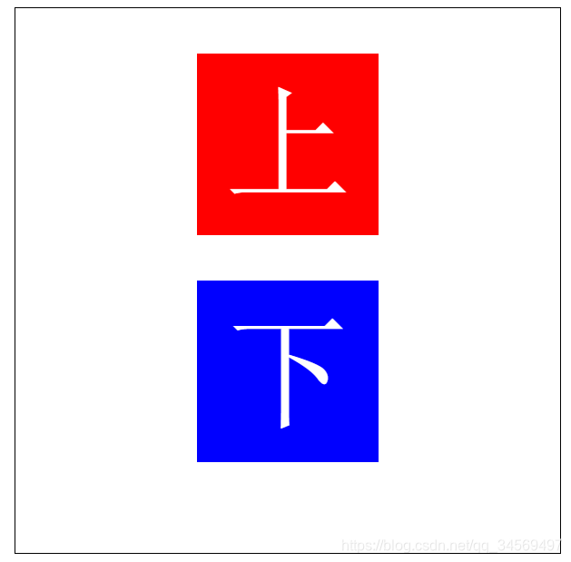
<head><meta charset="UTF-8"><meta name="viewport" content="width=device-width, initial-scale=1.0"><meta http-equiv="X-UA-Compatible" content="ie=edge"><title>Document</title><style>#wrap {width: 600px;height: 600px;border: 1px solid black;margin: 0 auto;}#box {width: 200px;height: 200px;background: red;margin: 200px auto;font: 140px/200px "宋体";text-align: center;color: white;transition: 3s;}#wrap:hover #box{/* 旋转totate */transform: rotate(-360deg);}</style>
</head>
<body><div id="wrap"><div id="box">上</div></div>
</body>
</html>animation实现旋转:
如果要设置一直旋转或其他操作就使用animation。把rotate()方法写在关键帧中。
animation实现旋转需要把transform旋转写在关键帧,再在对应元素样式中调用animation。
<!DOCTYPE html>
<html lang="en">
<head><meta charset="UTF-8"><meta name="viewport" content="width=device-width, initial-scale=1.0"><meta http-equiv="X-UA-Compatible" content="ie=edge"><title>Document</title><style>/* animation实现旋转就不能写在hover样式里,就需要把transform旋转写在关键帧,在关键帧中写旋转方法,再在对应样式中调用animation */@keyframes rotate{from {transform: rotate(180deg);}to {transform: rotate(360deg);}}#wrap {width: 600px;height: 600px;border: 1px solid black;margin: 0 auto;}#box {width: 200px;height: 200px;background: red;margin: 200px auto;font: 140px/200px "宋体";text-align: center;color: white;animation: 3s rotate infinite;}</style>
</head>
<body><div id="wrap"><div id="box">上</div></div>
</body>
</html>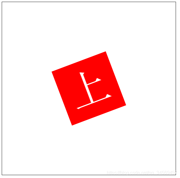
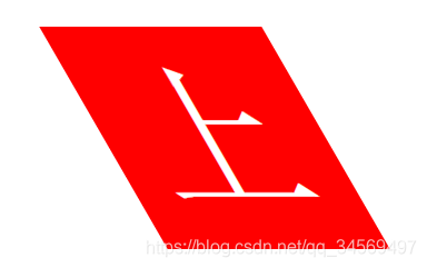
3.2 transform斜切:
transform斜切有三个方法:
- skew(x,y) : X轴和Y轴都进行拉伸
- skewX() : 沿着X轴方向拉,使其与Y轴形成对应夹角。
- skewY() : 沿着Y轴方向拉,使其与X轴形成对应夹角。
shewX(): 角度为正数,沿着X轴方向拉两个对角(左上角和右下角),使其与Y轴形成对应角度的夹角;如果角度为负值,拉伸对角相反,沿着X轴方向拉两个对角(右上角和左下角),使其与Y轴形成对应角度的夹角;
<!DOCTYPE html>
<html lang="en">
<head><meta charset="UTF-8"><meta name="viewport" content="width=device-width, initial-scale=1.0"><meta http-equiv="X-UA-Compatible" content="ie=edge"><title>Document</title><style>#wrap {width: 600px;height: 600px;border: 1px solid black;margin: 0 auto;}#box {width: 200px;height: 200px;background: red;margin: 200px auto;font: 140px/200px "宋体";text-align: center;color: white;transition: 3s;}#wrap:hover #box{/* 斜切skewX() */transform: skewX(30deg);}</style>
</head>
<body><div id="wrap"><div id="box">上</div></div>
</body>
</html>

shewY(): 角度为正数,沿着Y轴方向拉两个对角(左上角和右下角),使其与X轴形成对应角度的夹角;如果角度为负值,拉伸对角相反,沿着Y轴方向拉两个对角(右上角和左下角),使其与X轴形成对应角度的夹角;
/* 斜切skewY() */transform: skewY(30deg);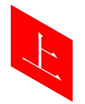

skew(x,y) :X轴和Y轴都进行拉伸
/* 斜切skew() */transform: skew(-40deg,-30deg);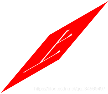
注意:skew(0)和skew(180)位置不一样。 skew(0)不会变化,skew(180)斜切180度。
3.3 transform 缩放:
transform缩放三个方法:transform缩放本身没有单位,只有倍数
- scale(x,y) : X,Y 轴都缩放
- scaleX() :X轴缩放
- scaleY() :Y轴缩放
scale(x,y) :
/* scale(x,y)缩放X 和 Y轴 */transform: scale(.5); scaleX():
/* scaleX()缩放X轴 */transform: scaleX(.5); scaleY():
/* scaleY()缩放Y轴 */transform: scaleY(.5);3.4 transform 位移:
translate位移三个方法,单位像素或其他
- translate(x,y):沿x和y轴定位方向位移
- translateX() :沿X轴方向位移
- translateY() :沿Y轴方向位移
translate(x,y):
/* translate(x,y)向X 和 Y轴坐标方向位移 */transform: translate(100px,200px); translateX():
/* translateX()X轴方向位移 */transform: translateX(200px);translateY():
/* translateY()缩放Y轴方向位移 */transform: translateY(200px);3.4 transform多函数书写时的执行顺序问题
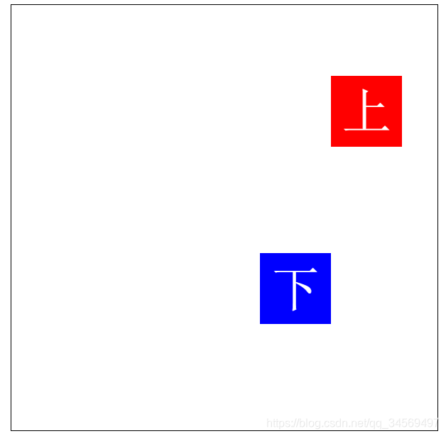
transform中写多个函数(缩放,斜切,位移,旋转同时写)时,后写先计算。
原因:CSS本身的解读顺序有关,CSS本身解读顺序就是从右向左进行解读。
<!DOCTYPE html>
<html lang="en">
<head><meta charset="UTF-8"><meta name="viewport" content="width=device-width, initial-scale=1.0"><meta http-equiv="X-UA-Compatible" content="ie=edge"><title>Document</title><style>#wrap {width: 600px;height: 600px;border: 1px solid black;margin: 0 auto;}#box1 {width: 200px;height: 200px;background: red;margin: 50px auto;font: 140px/200px "宋体";text-align: center;color: white;transition: 1s;}#box2 {width: 200px;height: 200px;background: blue;margin: 0 auto;font: 140px/200px "宋体";text-align: center;color: white;transition: 1s;}#wrap:hover #box1{transform: translateX(200px) scale(0.5);/* transform: translateY(200px) scale(0.5);  */}#wrap:hover #box2{transform: scale(0.5) translateX(200px);/* transform: scale(0.5) translateY(200px); */}</style>
</head>
<body><div id="wrap"><div id="box1">上</div><div id="box2">下</div></div>
</body>
</html>
解析: 都是进行transform: scale(0.5) translateX(200px);缩放和X轴位移,但是发现box2的X轴位置和box1不一样,因为box1会先缩放0.5倍,再位移200px,而box2会先位移200px,再缩放0.5倍,所以整体box2比box1X轴方向少100px。
3.5 transform源点(锚点)transform-origin
transform源点:默认旋转、缩放、斜切都是围绕着元素的中心点进行变换。这是由于transform-origin变换基点的默认值决定。
transform-origin变换基点(旋转、缩放、斜切 围绕的哪个点进行操作):
- transform-origin默认值center center,即元素的正中心;
- 0,0点在元素的左上角;
- 其他自定义设置的点,在元素的具体对应位置。如transform-origin: 400px 400px;
位移本身围绕自己设置的轴进行位移所以没有源点的概念。
注意transform-origin: 400px 400px;设置在需要进行对应操作的元素上。
<!DOCTYPE html>
<html lang="en">
<head><meta charset="UTF-8"><meta name="viewport" content="width=device-width, initial-scale=1.0"><meta http-equiv="X-UA-Compatible" content="ie=edge"><title>Document</title><style>#wrap {width: 600px;height: 600px;border: 1px solid black;margin: 0 auto;}#box {width: 200px;height: 200px;background: red;margin: 200px auto;font: 140px/200px "宋体";text-align: center;color: white;transition: 1s;transform-origin: 400px 400px;}#wrap:hover #box{transform: scale(.5) rotate(360deg);}</style>
</head>
<body><div id="wrap"><div id="box">上</div></div>
</body>
</html>
3.6 transform应用一(时钟表盘)
纯CSS实现,使用图片,使用canvas位图三种实现方式,canvas位图方式相对性能最高。
思路:这里使用css实现
- 通过CSS画出表盘的刻度样式:li的源点为表盘的中心,没隔5个样式不一样li:nth-of-type(5n+1);
- 通过JS生成60个li;
- 设置时分秒指针,并进行定位,设置变换基点围绕底部进行旋转,设置中心点(为美观);
- 获取时分秒的时间,一秒钟秒钟指针走一个li(6度),一分钟分钟指针也走一个li(6度),一小时小时指针走5个li即30度;
- 通过定时器,控制各个指针走动;
- 需要给时针和分针获取到小数位的小时或分钟,否则一小时会跳一整格;
<!DOCTYPE html>
<html lang="en">
<head><meta charset="UTF-8"><meta name="viewport" content="width=device-width, initial-scale=1.0"><meta http-equiv="X-UA-Compatible" content="ie=edge"><title>时钟表盘</title><style>ul,ul li {margin: 0;padding: 0;list-style: none;}#time {width: 200px;height: 200px;margin: 100px auto;border: 4px solid rgb(196, 13, 13);position: relative;border-radius: 50%;}#time li {width: 4px;height: 10px;background: rgba(255, 0, 0, 0.637);position: absolute;left: 98px;top: 0px;/* 源点:是以本元素为基点进行旋转 */transform-origin: 2px 100px;}/* 指定了父级元素下是 5 的倍数的第一个 li 背景色 */#time li:nth-of-type(5n+1){background: rgba(160, 20, 20, 0.863);height: 12px;}/* 给li设置的旋转样式 */.time_rotate {transform: rotate(0deg);}/* 2.设置时分秒针样式 */.hour {width: 6px;height: 50px;background: #000000;position: absolute;top: 50px;left: 97px;/* 设置上面两个角圆角时针 */border-radius:10px 10px 0 0 /50px;/* 设置所有角圆角 *//* border-radius:10/50px; border-top-left-radius:10px/50px;border-top-right-radius:10px/50px; */transform-origin: 3px 50px;}.minute {width: 4px;height: 60px;background: #d15f2a;position: absolute;top: 40px;left: 98px;border-radius:10px 10px 0 0 /50px;transform-origin: 2px 60px;}.second {width: 2px;height: 70px;background: #e0d20c;position: absolute;top: 30px;left: 99px;border-radius:10px 10px 0 0 /50px;transform-origin: 1px 70px;}.circle {width: 10px;height: 10px;background: #000000;position: absolute;top: 95px;left: 95px;border-radius: 50%;}</style>
</head>
<body>
<div id="time"><ul><!-- <li style="transform: rotate(0deg);"></li><li style="transform: rotate(6deg);"></li><li style="transform: rotate(12deg);"></li><li style="transform: rotate(18deg);"></li><li style="transform: rotate(24deg);"></li> --></ul><div class="hour"></div>    <div class="minute"></div>    <div class="second"></div> <div class="circle"></div>
</div>
<script>
//1.使用JS生成表盘刻度 总共有360度,和60和刻度,所以每个刻度代表6度
var time = document.querySelector("#time");
var ul = time.querySelector("ul");
var hour = time.querySelector(".hour");
var minute = time.querySelector(".minute");
var second = time.querySelector(".second");var len = 360/6;
var lis = '';
var timer = null;for (var i = 0; i < len; i++) {lis +='<li style="transform: rotate('+ i*6 +'deg);"></li>';
}
ul.innerHTML = lis;//3.通过定时器,让时分秒中动起来
setTime();
//每次开启定时器之前先关闭
clearInterval(timer);
timer = setInterval(setTime,1000);
function setTime(){var date = new Date();var seconds = date.getSeconds();var minutes = date.getMinutes() + seconds/60;var hours = date.getHours() + minutes/60;//4.时针和分针不能一次跳一大格,需要有小数点second.style.transform = 'rotate('+ seconds*6 +'deg)';minute.style.transform = 'rotate('+ minutes*6 +'deg)';//一个小时30度hour.style.transform = 'rotate('+ hours*30 +'deg)';
}
</script>
</body>
</html>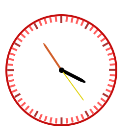
3.7 transform应用二(水滴按钮)
需求:鼠标移入时,有动画效果。
问题:使用hover实现时,发现鼠标离开后,动画就会停止了。
div:hover {animation: .5s move linear;}解决: 要实现复杂的动画就需要结合JS实现,且通过animationend监听事件结束后,清除已有样式,才会在鼠标再次移入时有动画效果
<!DOCTYPE html>
<html lang="en">
<head><meta charset="UTF-8"><meta name="viewport" content="width=device-width, initial-scale=1.0"><meta http-equiv="X-UA-Compatible" content="ie=edge"><title>水滴按钮</title><style>@keyframes move {0% {transform: scaleX(1) scaleY(.75);}10% {transform: scaleY(.8) scaleX(.95);}20% {transform: scaleX(.9) scaleY(.85);}30% {transform: scaleY(.9) scaleX(.85);}40% {transform: scaleX(.8) scaleY(.95);}50% {transform: scaleY(1) scaleX(.75);}60% {transform: scaleX(.8) scaleY(.95);}70% {transform: scaleY(.85) scaleX(.9);}80% {transform: scaleX(.85) scaleY(.9);}90% {transform: scaleY(.8) scaleX(.95);}100% {transform: scaleX(1) scaleY(.75);}}div {width: 50px;height: 50px;margin: 100px auto;background: rgb(138, 137, 137);border-radius: 50%;font: 18px/50px "宋体";font-weight: bold;color: #ffffff;text-align: center;}/* div:hover {animation: .5s move linear;} */.btn_hover {animation: .4s move linear 2; }</style>
</head>
<body><div class="btn">More</div>
<script>
var btn = document.querySelector(".btn");
var water = document.querySelector(".water");
btn.addEventListener('mouseover',function(){btn.classList.add("btn_hover");
});
btn.addEventListener('animationend',function(){btn.classList.remove("btn_hover");
});
</script>
</body>
</html>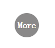
3.8 JS获取transform (matrix)
transform可供操作的只有一个值matrix,即矩阵。transform 2D 矩阵共有9位,默认三位不能操作,可供操作的只有6位。transform 3D 矩阵共有16位,默认四位不能操作,可供操作的只有12位。
而transform的旋转,斜切,位移,缩放都是CSS封装的操作matrix的各种方法。
matrix是不可逆的,即通过matrix是不能推出元素之前做过旋转,斜切,位移,缩放哪些操作。所以transform的操作不能获取。
- matrix(a,b,c,d,e,f) 矩阵函数 :默认值 matrix(1,0,0,1,0,0);
- 通过矩阵实现缩放
- x轴缩放 a=x*a c=x*c e=x*e;
- y轴缩放 b=y*b d=y*d f=y*f;
- 通过矩阵实现位移
- x轴位移: e=e+x
- y轴位移: f=f+y
- 通过矩阵实现倾斜
- x轴倾斜: c=Math.tan(xDeg/180*Math.PI)
- y轴倾斜: b=Math.tan(yDeg/180*Math.PI)
- 通过矩阵实现旋转
- a=Math.cos(deg/180*Math.PI);
- b=Math.sin(deg/180*Math.PI);
- c=-Math.sin(deg/180*Math.PI);
- d=Math.cos(deg/180*Math.PI);
弧度转角度:deg*180/Math.PI
角度转弧度:deg/180*Math.PI
三角函数:
- tan正切:直角三角形中,对边与邻边的比值
- sin正弦:直角三角形中,对边与斜边的比值
- cos余弦:直角三角形中,邻边与斜边的比值
需求:每次点击时,让box在现有基础上,继续旋转15度。
所以一开始需要获取到box的旋转角度,但是transform是获取不到的,只能操作其上面的matrix矩阵。
<!DOCTYPE html>
<html lang="en">
<head><meta charset="UTF-8"><meta name="viewport" content="width=device-width, initial-scale=1.0"><meta http-equiv="X-UA-Compatible" content="ie=edge"><title>Document</title><style>#box {width: 100px;height: 100px;background: red;margin: 100px auto;font: 80px/100px "宋体";text-align: center;}</style>
</head>
<body><div id="box">上</div><script>(function(){// matrix(1,0,0,1,0,0);var a = 1;var b = 0;var c = 0;var d = 1;var e = 0;var f = 0;//matrix(a,b,c,d,e,f)var box = document.querySelector("#box");// 位移 x轴位移: e=e+xfunction translateX(x){e += x;box.style.transform = 'matrix('+a+','+b+','+c+','+d+','+e+','+f+')';//matrix(a,b,c,d,e,f)}// 位移 y轴位移: f=f+yfunction translateY(y){f += y;box.style.transform = 'matrix('+a+','+b+','+c+','+d+','+e+','+f+')';}//缩放 x轴缩放 a=x*a    c=x*c     e=x*e;function scaleX(x){a=x*a;c=x*c;e=x*e;box.style.transform = 'matrix('+a+','+b+','+c+','+d+','+e+','+f+')';}//缩放 y轴缩放 b=y*b   d=y*d     f=y*f;function scaleY(y){b=y*b;d=y*d;f=y*f;box.style.transform = 'matrix('+a+','+b+','+c+','+d+','+e+','+f+')';}// 通过矩阵实现倾斜 // x轴倾斜 c=Math.tan(xDeg/180*Math.PI)function skewX(xDeg){c=Math.tan(xDeg/180*Math.PI);box.style.transform = 'matrix('+a+','+b+','+c+','+d+','+e+','+f+')';}// y轴倾斜: b=Math.tan(yDeg/180*Math.PI)function skewY(yDeg){b=Math.tan(yDeg/180*Math.PI);box.style.transform = 'matrix('+a+','+b+','+c+','+d+','+e+','+f+')';}//通过矩阵实现旋转function rotate(deg){a=Math.cos(deg/180*Math.PI); b=Math.sin(deg/180*Math.PI);c=Math.sin(deg/180*Math.PI);d=Math.cos(deg/180*Math.PI);box.style.transform = 'matrix('+a+','+b+','+c+','+d+','+e+','+f+')';}box.onclick = function(){//x轴位移// translateX(10);//y轴位移// translateY(20);//x轴缩放// scaleX(.5);//y轴缩放// scaleY(.5);//x轴倾斜// skewX(40);//y轴倾斜// skewY(60);rotate(60);};})();</script>
</body>
</html>
4.transform 3D
4.1 transform 3D方法
- 3D旋转:
- rotateX() 围绕X轴旋转(上下翻转)
- rotateY() 围绕Y轴旋转(左右翻转)
- rotateZ() 围绕Z轴旋转
- 3D位移:
- translateZ() Z轴位移,近大远小。单位像素
- transform-style :3D空间。父级进行3D变换时,是否保留子元素的3D变换。默认值flat平面不保留子级3D变换;preserve-3d保留。
- perspective :景深,在3D变换中,模拟我们的视角,去看元素在Z轴的距离。一般在父级添加。
- perspective-origin:景深基点,在3D变换中,我们的视角点。一般在父级添加。
- backface-visibility: hidden;隐藏背面:加给 3d 每一个面 。背面:和父级角度相对面
<!DOCTYPE html>
<html lang="en">
<head><meta charset="UTF-8"><meta name="viewport" content="width=device-width, initial-scale=1.0"><meta http-equiv="X-UA-Compatible" content="ie=edge"><title>Document</title><style>#wrap {width: 600px;height: 600px;border: 1px solid black;margin: 0 auto;/* 景深:在3D变换中,模拟我们的视角去看元素与Z轴的距离*/perspective: 200px;}#box {width: 200px;height: 200px;background: red;margin: 200px auto;font: 140px/200px "宋体";text-align: center;color: white;transition: 3s;/* 3D空间,父级元素变换时,是否保留子元素的3D变换 preserve-3d保留,flat不保留*/transform-style: preserve-3d;}#wrap:hover span {display: block;width: 200px;height: 200px;background: yellow;transform: rotateX(45deg);}#wrap:hover #box{/* 3D变换,围绕X轴旋转 */transform: rotateY(360deg);/* 3D变换,围绕Y轴旋转 *//* transform: rotateY(180deg); *//* 3D变换,围绕Y轴旋转 *//* transform: rotateZ(180deg); *//* 3D变换,Z轴位移 *//* transform: translateZ(60px); */}</style>
</head>
<body><div id="wrap"><div id="box"><span></span></div></div>
</body>
</html>
4.2 搭建立方体
思路:先写好立方体的6个面,在旋转每个面。
景深大小;各个面的绝对定位;各个面的旋转基点transform-origin
<!DOCTYPE html>
<html lang="en">
<head><meta charset="UTF-8"><meta name="viewport" content="width=device-width, initial-scale=1.0"><meta http-equiv="X-UA-Compatible" content="ie=edge"><title>Document</title><style>#wrap {width: 600px;height: 600px;border: 1px solid black;margin: 0 auto;perspective: 1000px;/* 景深基点 */perspective-origin: center center;}#box {width: 200px;height: 200px;position: relative;transform-style: preserve-3d;transition: 3s;}#wrap #box div{width: 200px;height: 200px;font: 140px/200px "宋体";text-align: center;position: absolute;opacity: .5;}#box div:nth-child(1) {background: rgb(255, 0, 0);top: 0;left: 200px;/* 只围绕底部,可只写bottom */transform-origin: bottom;transform: rotateX(90deg);}#box div:nth-child(2) {background: rgb(200, 255, 0);top: 200px;left: 0;transform-origin: right;transform: rotateY(-90deg);}#box div:nth-child(3) {background: rgb(0, 255, 115);top: 200px;left: 200px;/* transform-origin: 200px bottom;transform: rotateX(90deg); */}#box div:nth-child(4) {background: rgb(0, 153, 255);top: 200px;left: 400px;transform-origin: left;transform: rotateY(90deg);}#box div:nth-child(5) {background: rgb(132, 0, 255);top: 400px;left: 200px;transform-origin: top;transform: rotateX(-90deg);}#box div:nth-child(6) {background: rgb(255, 0, 200);top: 200px;left: 200px;/* 第6面是在Z轴方向 */transform: translateZ(-200px) rotateY(180deg);}#wrap:hover #box{ transform-origin: 300px 300px;transform: rotateY(180deg);}</style>
</head>
<body><div id="wrap"><div id="box"><div>1</div><div>2</div><div>3</div><div>4</div><div>5</div><div>6</div></div></div>
</body>
</html>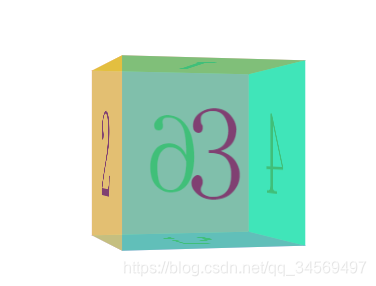
5.requestAnimationFarme动画帧
人眼每秒可识别24帧,超过24帧在人眼中,就会形成连续动画的错觉。所以使用JS制作动画,不断修改元素的值,就可以实现动画效果。
能使用CSS实现的效果,尽量使用CSS实现,而不是使用JS实现。CSS本身性能会比JS好。另外,一般做动画,能操作transform改变的,不要使用修改left,top等值实现,因为这些属性在解析完成后,会导致回流。
requestAnimationFarme动画帧不是CSS中的动画帧,而是JS中本身存在的,window下的方法。
requestAnimationFarme动画帧与定时器相关区别:动画流畅度和性能都比定时器好。使用定时器做动画有可能丢帧(画面忽然卡一下)。
- 计算机显示器刷新频率一般是60Hz,相当于每秒重绘60次
- 屏幕每次渲染时就会调用当前次requestAnimationFarme(注意并不是重复调用),看当前次requestAnimationFarme有没有执行新的东西
- 动画帧采用的是系统时间间隔,它与计算机屏幕重绘频率保持一致(高性能,视觉佳)
- 定时器执行时间间隔(16.6666循环)不精确
- 兼容性 IE9 以下不兼容
- 与setTimeOut类似,只会执行一次,如果希望执行动画效果,连续执行,就需要使用递归进行重复调用
- 注意递归调用多次都需要存储requestAnimationFrame动画帧编号,便于取消requestAnimationFrame
- 开启动画帧:index requestAnimationFrame(fn):参数为函数(只有一个参数),返回值为动画帧对应编号
- 关闭动画帧:cancelAnimationFrame()
需求:使用JS实现跑停动画
使用定时器实现:
使用间隔定时器,不断改变div的transform的值
<!DOCTYPE html>
<html lang="en">
<head><meta charset="UTF-8"><meta name="viewport" content="width=device-width, initial-scale=1.0"><meta http-equiv="X-UA-Compatible" content="ie=edge"><title>Document</title><style>#box {width: 100px;height: 100px;background: red;margin-bottom: 50px;}</style>
</head>
<body><div id="box"></div><button>跑</button><button>停</button><script>var box = document.querySelector("#box");var l = 0;var btns = document.querySelectorAll("button");var timer = null;btns[0].onclick = function(){clearInterval(timer);timer = setInterval(function(){l +=10;box.style.transform = 'translateX('+ l +'px)';},50);};btns[1].onclick = function(){clearInterval(timer);};</script>
</body>
</html>
问题:发现使用定时器实现的动画,并不流畅。
解决:使用requestAnimationFrame实现
注意递归调用多次都需要存储requestAnimationFrame动画帧编号,便于取消requestAnimationFrame
<!DOCTYPE html>
<html lang="en">
<head><meta charset="UTF-8"><meta name="viewport" content="width=device-width, initial-scale=1.0"><meta http-equiv="X-UA-Compatible" content="ie=edge"><title>Document</title><style>#box {width: 100px;height: 100px;background: red;margin-bottom: 50px;}</style>
</head>
<body><div id="box"></div><button>跑</button><button>停</button><script>var box = document.querySelector("#box");var l = 0;var btns = document.querySelectorAll("button");var runner = 0;btns[0].onclick = function(){cancelAnimationFrame(runner);runner = requestAnimationFrame(setTranslateX);function setTranslateX(){l +=1;box.style.transform = 'translateX('+ l +'px)';runner = requestAnimationFrame(setTranslateX);}};btns[1].onclick = function(){cancelAnimationFrame(runner);};</script>
</body>
</html>
6.Tween 动画公式
- Tween 参数解析
- - t: current time(当前时间-当前运动次数),动画执行到第几次(动画已经消耗的时间)
- - b: beginning value(动画开始前的初始值)
- - c: change in value(变化量:动画初始值和目标点之间的差值)
- - d: duration(持续时间-运动总次数:动画执行总次数)
Tween动画算法:
/*Tween 动画算法
*/
var Tween = {linear: function (t, b, c, d){  //匀速return c*t/d + b;},easeIn: function(t, b, c, d){  //加速曲线return c*(t/=d)*t + b;},easeOut: function(t, b, c, d){  //减速曲线return -c *(t/=d)*(t-2) + b;},easeBoth: function(t, b, c, d){  //加速减速曲线if ((t/=d/2) < 1) {return c/2*t*t + b;}return -c/2 * ((--t)*(t-2) - 1) + b;},easeInStrong: function(t, b, c, d){  //加加速曲线return c*(t/=d)*t*t*t + b;},easeOutStrong: function(t, b, c, d){  //减减速曲线return -c * ((t=t/d-1)*t*t*t - 1) + b;},easeBothStrong: function(t, b, c, d){  //加加速减减速曲线if ((t/=d/2) < 1) {return c/2*t*t*t*t + b;}return -c/2 * ((t-=2)*t*t*t - 2) + b;},elasticIn: function(t, b, c, d, a, p){  //正弦衰减曲线(弹动渐入)if (t === 0) { return b; }if ( (t /= d) == 1 ) {return b+c; }if (!p) {p=d*0.3; }if (!a || a < Math.abs(c)) {a = c; var s = p/4;} else {var s = p/(2*Math.PI) * Math.asin (c/a);}return -(a*Math.pow(2,10*(t-=1)) * Math.sin( (t*d-s)*(2*Math.PI)/p )) + b;},elasticOut: function(t, b, c, d, a, p){    //*正弦增强曲线(弹动渐出)if (t === 0) {return b;}if ( (t /= d) == 1 ) {return b+c;}if (!p) {p=d*0.3;}if (!a || a < Math.abs(c)) {a = c;var s = p / 4;} else {var s = p/(2*Math.PI) * Math.asin (c/a);}return a*Math.pow(2,-10*t) * Math.sin( (t*d-s)*(2*Math.PI)/p ) + c + b;},    elasticBoth: function(t, b, c, d, a, p){ if (t === 0) {return b;}if ( (t /= d/2) == 2 ) {return b+c;}if (!p) {p = d*(0.3*1.5);}if ( !a || a < Math.abs(c) ) {a = c; var s = p/4;}else {var s = p/(2*Math.PI) * Math.asin (c/a);}if (t < 1) {return - 0.5*(a*Math.pow(2,10*(t-=1)) * Math.sin( (t*d-s)*(2*Math.PI)/p )) + b;}return a*Math.pow(2,-10*(t-=1)) * Math.sin( (t*d-s)*(2*Math.PI)/p )*0.5 + c + b;},backIn: function(t, b, c, d, s){     //回退加速(回退渐入)if (typeof s == 'undefined') {s = 1.70158;}return c*(t/=d)*t*((s+1)*t - s) + b;},backOut: function(t, b, c, d, s){if (typeof s == 'undefined') {s = 1.70158;  //回缩的距离}return c*((t=t/d-1)*t*((s+1)*t + s) + 1) + b;}, backBoth: function(t, b, c, d, s){if (typeof s == 'undefined') {s = 1.70158; }if ((t /= d/2 ) < 1) {return c/2*(t*t*(((s*=(1.525))+1)*t - s)) + b;}return c/2*((t-=2)*t*(((s*=(1.525))+1)*t + s) + 2) + b;},bounceIn: function(t, b, c, d){    //弹球减振(弹球渐出)return c - Tween['bounceOut'](d-t, 0, c, d) + b;},       bounceOut: function(t, b, c, d){//*if ((t/=d) < (1/2.75)) {return c*(7.5625*t*t) + b;} else if (t < (2/2.75)) {return c*(7.5625*(t-=(1.5/2.75))*t + 0.75) + b;} else if (t < (2.5/2.75)) {return c*(7.5625*(t-=(2.25/2.75))*t + 0.9375) + b;}return c*(7.5625*(t-=(2.625/2.75))*t + 0.984375) + b;},      bounceBoth: function(t, b, c, d){if (t < d/2) {return Tween['bounceIn'](t*2, 0, c, d) * 0.5 + b;}return Tween['bounceOut'](t*2-d, 0, c, d) * 0.5 + c*0.5 + b;}
};
Tween的使用:
(function(){var box = document.querySelector("#box");//easeOut: function(t, b, c, d) //减速曲线var t = 0;//动画执行到第几次(动画已经消耗的时间)var b = 0;//动画开始前的初始值var c = 500;//动画初始值和目标点的差值var d = 10;//动画执行总次数var s = 100;//回退的距离var btns = document.querySelectorAll("button");btns[0].onclick = function(){t++;var val = Tween["easeOut"](t, b, c, d);box.style.transform = 'translateX('+ val +'px)';};})();动画帧中使用Tween:
(function(){var box = document.querySelector("#box");//bounceIn: function(t, b, c, d) //弹球减振(弹球渐出)var t = 0;//动画执行到第几次(动画已经消耗的时间)var b = 0;//动画开始前的初始值(如初始宽度等)var c = 500;//动画初始值和目标点的差值(如希望动画走600,初始值为100,则差值应设置为500)var d = 20;//动画执行总次数var s = 100;//回退的距离var btns = document.querySelectorAll("button");var timer = 0;btns[0].onclick = function(){cancelAnimationFrame(timer);timer = requestAnimationFrame(move);function move(){t++;var val = Tween["bounceIn"](t, b, c, d);box.style.transform = 'translateX('+ val +'px)';console.log(t);//判断当执行次数到达设置的次数时,不再继续执行if(t<d){timer = requestAnimationFrame(move);}}};btns[1].onclick = function(){cancelAnimationFrame(timer);};})();7.动画框架mTween的使用
- css(el,attr[,value]) css 函数 设置或获取样式- 注意: 非数值类样式的处理- 注意: transform 相关样式的处理问题- mTween(option) 动画函数- option:{el: element要动画的元素,attr: {要动画的样式: '目标值',要动画的样式2: '目标值'},duration: nub||op, 动画时间- op: {multiple: 根据距离计算动画时间比例max: 动画最大时间min: 动画最小时间}fx:'动画形式',moveing: function(){}, 动画执行中回调cb:function(){} 动画执行之后回调}- mTween.stop(el) 停止某个元素的动画css(el,attr[,value]) css 函数 设置或获取样式,两个参数时是获取,三个参数时是设置样式。因为css方法主要是配合动画使用的,所以单位进行了处理。
- - 注意: 非数值类样式的处理:非数值类样式只能获取,不能设置,更不能用于动画;
- - 注意: transform 相关样式的处理问题:transform 不能获取计算后样式,所以必须通过css()方法进行操作,且必须先设置(给定初始化值),再获取即可
只有以下样式可以用于动画:
"background""opacity""rotate","rotateX","rotateY","rotateZ","translateX","translateY","translateZ","scale","scaleX","scaleY","skewX","skewY""width","height","left","top","right","bottom","marginBottom","marginleft","marginRight","marginTop","paddingLeft","paddingRight","paddingTop","paddingBottom"
<!DOCTYPE html>
<html lang="en">
<head><meta charset="UTF-8"><meta name="viewport" content="width=device-width, initial-scale=1.0"><meta http-equiv="X-UA-Compatible" content="ie=edge"><title>Document</title><style>#box {position: absolute;left: 0;top: 100px;width: 100px;height: 100px;background: red;}</style>
</head>
<body>
<div id="box"></div>
<script src="mTween.js"></script>
<script>
(function(){var box = document.querySelector("#box");//获取样式console.log(css(box,"width"));//100注意没有单位,mTween框架已经对单位进行了处理//设置样式css(box,"height",400);//非数值类样式只能获取,不能设置,但是颜色可以设置css(box,"background","blue");console.log(css(box,"background"));//rgb(0, 0, 255) none repeat scroll 0% 0% / auto padding-box border-boxcss(box,"float","left");console.log(css(box,"float"));//none})();
</script>
</body>
</html>
transform 相关样式的处理问题:
//transform不能获取计算后样式,所以所有操作必须通过css()方法进行。且需要先设置再获取console.log(css(box,"translateX"));//undefinedcss(box,"translateX",20);console.log(css(box,"translateX"));//20mTween同时设置多个值:需要传一个对象进去
//同时设置多个样式,需要传入一个对象css(box,{"width":200,"height":200,"background":"blue","translateX":200});动画框架的使用:
设置属性值:
mTween({el:box,attr:{width:200,height:200,// translateX:20rotate:360});设置动画持续时间:
//动画持续时间(单位秒),默认时间400毫秒// duration:1000//动画持续时间第二种用法,比例设置:duration:{multiple: 1,//根据距离计算动画时间比例:获取到attr样式中最大差值,计算时间,此处360,然后360*1 就为360毫秒min: 200,//动画最大时间:如果 multiple*最大差值的时间小于min,则使用min的时间,非min和max,则使用multiple*最大差值的时间max: 1000//动画最小时间:如果 multiple*最大差值的时间大于max,则使用max的时间,非min和max,则使用multiple*最大差值的时间},设置动画执行样式:
//动画执行样式(参照transition)fx:"linear",设置回调函数:动画执行中和动画执行结束 回调
//回调:动画执行中和动画执行结束cb:function(){console.log("动画执行完成");//控制动画过程:想在动画执行完成后,再执行其他的动画,直接在cb函数值再进行调用mTween({el:box,attr:{translateX:40 }});},//动画执行过程中:计算机每秒执行60次,在duration给定时间内,会打印duration/60次。即一次打印用时1000/60 = 16.6666666次。总共有16.666666*3次约等于50次moveing:function(){console.log("动画执行过程中");//打印66次}动画执行过程中结束动画:
//想在动画执行过程中结束动画,mTween.stop(动画执行的元素)mTween.stop(box);完整示例:
<!DOCTYPE html>
<html lang="en">
<head><meta charset="UTF-8"><meta name="viewport" content="width=device-width, initial-scale=1.0"><meta http-equiv="X-UA-Compatible" content="ie=edge"><title>Document</title><style>#box {width: 100px;height: 100px;background: red;margin-bottom: 50px;}</style>
</head>
<body><div id="box"></div><button>执行</button><button>停</button><script src="mTween.js"></script><script>var box = document.querySelector("#box");var btns = document.querySelectorAll("button");btns[0].onclick = function(){//如果要设置transform,一定要先通过css()方法进行设置css(box,"translateX",0);css(box,"rotate",0);//动画框架的使用mTween({el:box,attr:{width:200,height:200,// translateX:20rotate:360},//动画持续时间(单位秒),默认时间400毫秒// duration:1000//动画持续时间第二种用法,比例设置:duration:{multiple: 1,//根据距离计算动画时间比例:获取到attr样式中最大差值,计算时间,此处360,然后360*1 就为360毫秒min: 200,//动画最大时间:如果 multiple*最大差值的时间小于min,则使用min的时间,非min和max,则使用multiple*最大差值的时间max: 1000//动画最小时间:如果 multiple*最大差值的时间大于max,则使用max的时间,非min和max,则使用multiple*最大差值的时间},//动画执行样式(参照transition)fx:"linear",//回调:动画执行中和动画执行结束cb:function(){console.log("动画执行完成");//控制动画过程:想在动画执行完成后,再执行其他的动画,直接在cb函数值再进行调用mTween({el:box,attr:{translateX:40  }});},//动画执行过程中:计算机每秒执行60次,在duration给定时间内,会打印duration/60次。即一次打印用时1000/60 = 16.6666666次。总共有16.666666*3次约等于50次moveing:function(){console.log("动画执行过程中");//打印66次}});btns[1].onclick = function(){//想在动画执行过程中结束动画,mTween.stop(动画执行的元素)mTween.stop(box);};};</script>
</body>
</html>8.动画框架mTween示例―无缝滚动幻灯片