前言
本文前期工作是将sqlite数据库内的数据进行连接聚合查询,得到不同维度的数据并保存在本地的csv文件中,然后运用seaborn、matplotlib、pyecharts绘制各种图形
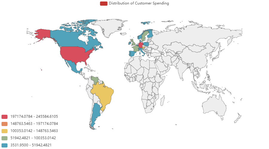
pyecharts绘制地图
pyecharts是一款将python与echarts结合的强大的数据可视化工具,本文主要用地图函数,绘制不同国家消费额的情况。安装完pyrcharts之后记得手动导入地图:
全球国家地图: echarts-countries-pypkg (1.9MB)
中国省级地图: echarts-china-provinces-pypkg (730KB)
中国市级地图: echarts-china-cities-pypkg (3.8MB)
pip install echarts-countries-pypkg
pip install echarts-china-provinces-pypkg
pip install echarts-china-cities-pypkg
maptype:地图类型,可以选择 world、china、省市名
is_piecewise : 是否分段显示
is_show : 是否带标记点
from pyecharts.charts import Map
# from pyecharts import options as opts
# import pandas as pd
# os.chdir(r'F:\学习文档\20190801-假期作业\实战数据')
# value = [245584.6105, 230284.6335, 128003.8385, 106925.7765, 81358.3225,
#             58971.31, 56810.629, 54495.14, 50196.29, 49979.905, 33824.855,
#             32661.0225, 31692.659, 23582.0775, 18810.0525, 17983.2, 15770.155,
#             11472.3625, 8119.1, 5735.15, 3531.95]
# country = ['United States', 'Germany', 'Austria', 'Brazil', 'France', 'United Kingdom',
#           'Venezuela', 'Sweden', 'Canada', 'Ireland', 'Belgium', 'Denmark', 'Switzerland',
#           'Mexico', 'Finland', 'Spain', 'Italy', 'Portugal', 'Argentina', 'Norway', 'Poland']
#
# cus_map = Map()
# cus_map.add('Distribution of Customer Spending', [list(z) for z in zip(country, value)], maptype="world",
#             is_map_symbol_show=False).set_series_opts(label_opts=opts.LabelOpts(is_show=False)).set_global_opts(
#             title_opts=opts.TitleOpts(title=""),
#             visualmap_opts=opts.VisualMapOpts(min_= min(value), max_=max(value),is_piecewise=True))
# cus_map.render(path="./下过订单的客户国家分布-分段.html")
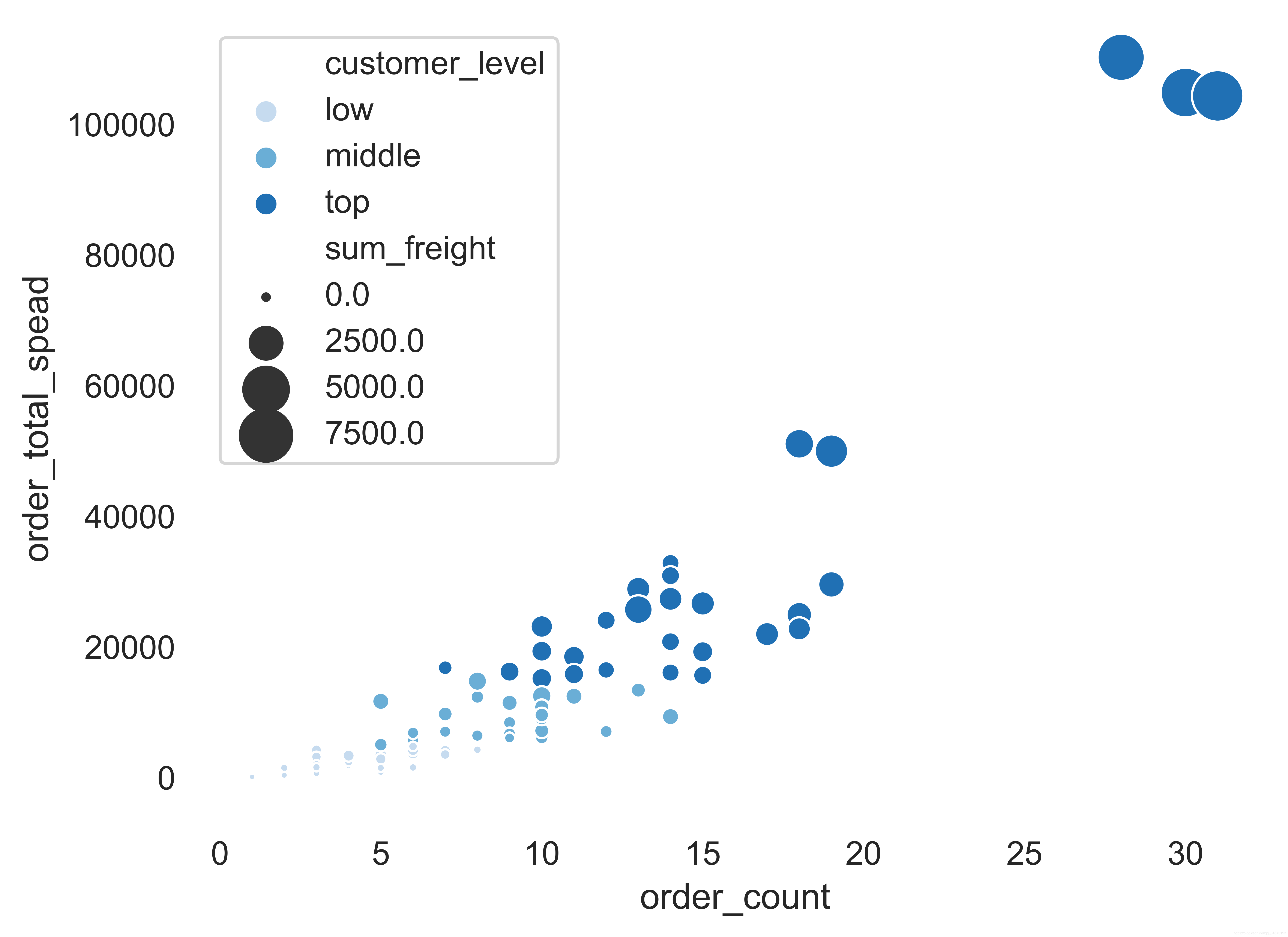
使用seaborn展示scatterplot()四维特征
数据格式:
参数:hue 分类标签
hue_order 分类标签的顺序
size 图标大小显示哪一个属性
sizes 图片大小
marker 分类图标的形状
palette 颜色设置,可通过sns.cubehelix_palette(),sns.color_palette()设置,分类为3个,所以配色应该筛选三种
os.chdir(r'F:\学习文档\20190801-假期作业\实战数据')
cou_cus_levle_freight = pd.read_csv(r'客户订单数量货物重量消费客户等级.csv')# sns.set(style='white', rc={'figure.figsize': (15, 12)})
sns.set(style='white',)
marker = {"top": "s", "middle": "X", "low":"o"}
cmap = sns.color_palette("Blues", 3)
# cmap=sns.cubehelix_palette(3, start=1, rot=3,)
ax = sns.scatterplot(x="order_count", y="order_total_spead",hue="customer_level", hue_order=['low', 'middle', 'top'],size="sum_freight", sizes=(5, 300),palette=cmap, data=cou_cus_levle_freight)
sns.despine(left=True, bottom=True)
plt.savefig(r'./*******.png')
plt.show()
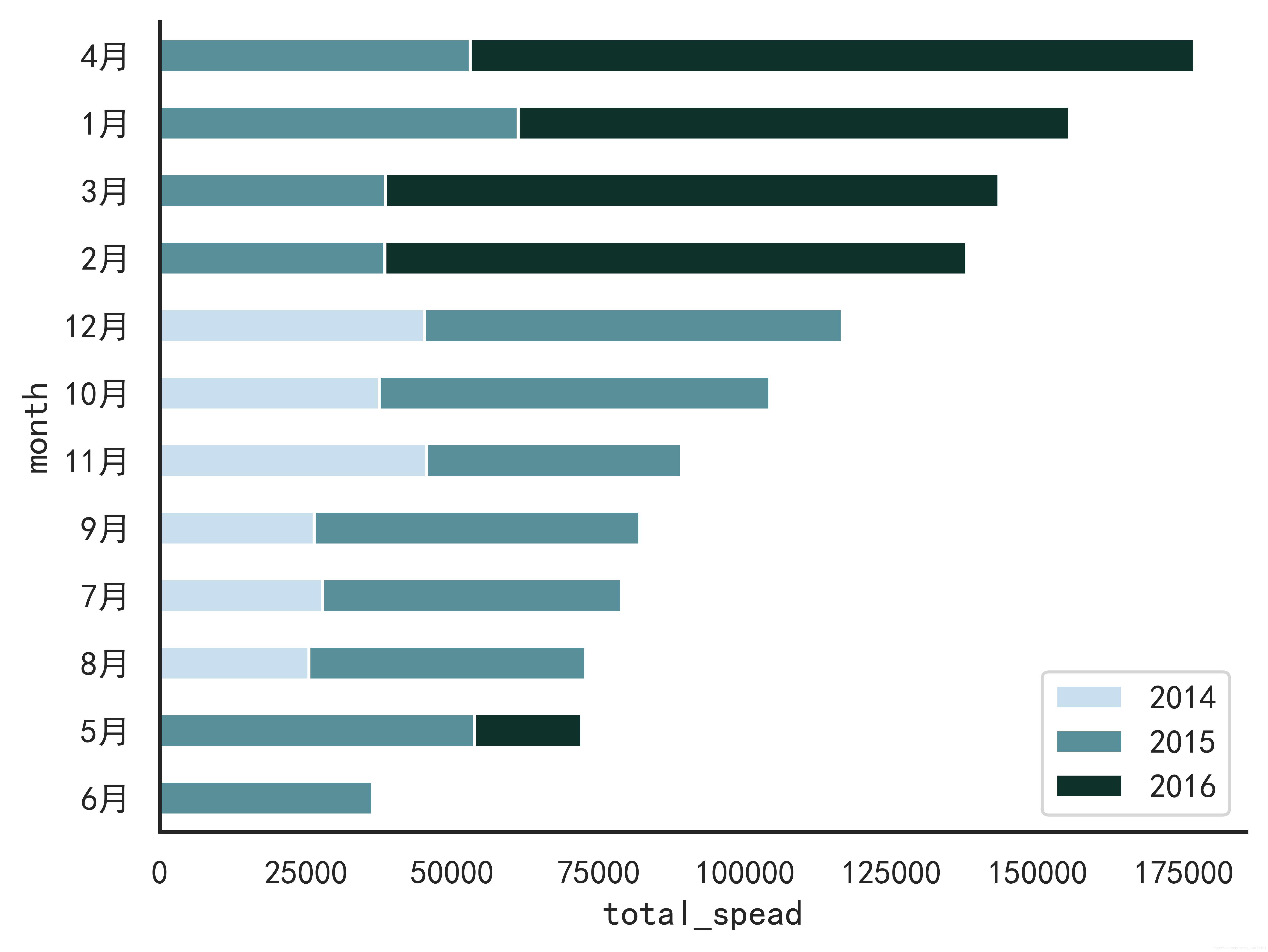
使用pandas的dataframe绘制柱状堆叠图
刚开始是想使用seaborn的barplot绘制,但是此方法其实是画两个柱状图叠加,针对三列数据一直没想到怎么去实现,最后想到直接使用pandas的datdframe数据的plot.bar()即可实现,差点南辕北辙了。
数据样式:是一个csv文件
month,2014,2015,2016,sum
1月,0,61258.07,94222.1105,155480.1805
2月,0,38483.635,99415.2875,137898.9225
3月,0,38547.22,104854.155,143401.375
4月,0,53032.9525,123798.6825,176831.635
5月,0,53781.29,18333.6305,72114.9205
6月,0,36362.8025,0,36362.8025
7月,27861.895,51020.8575,0,78882.7525
8月,25485.275,47287.67,0,72772.945
9月,26381.4,55629.2425,0,82010.6425
10月,37515.725,66749.226,0,104264.951
11月,45600.045,43533.809,0,89133.854
12月,45239.63,71398.4285,0,116638.0585
代码:
import pandas as pd
from matplotlib import pyplot as plt
import matplotlib as mpl
import seaborn as snsos.chdir(r'F:\学习文档\20190801-假期作业\实战数据')
month_spead_data = pd.read_csv(r'每年每月的销售额-2.csv', encoding='utf-8',index_col=0).sort_values('sum')
plt.rcParams['font.sans-serif'] = ['SimHei']  # 中文字体设置-黑体
plt.rcParams['axes.unicode_minus'] = False  # 解决保存图像是负号'-'显示为方块的问题
month_spead_data = month_spead_data.iloc[:,0:3]
sns.set(font='SimHei',style="whitegrid")
f, ax = plt.subplots()
cmap=sns.cubehelix_palette(3, start=1, rot=3)
ax = month_spead_data.plot.barh(stacked=True, color=cmap,)
plt.xlabel('total_spead')
sns.despine()
plt.savefig(r'./不年份不同月份消费额堆叠图.png', dpi=1000, bbox_inches='tight')
plt.show()
结果
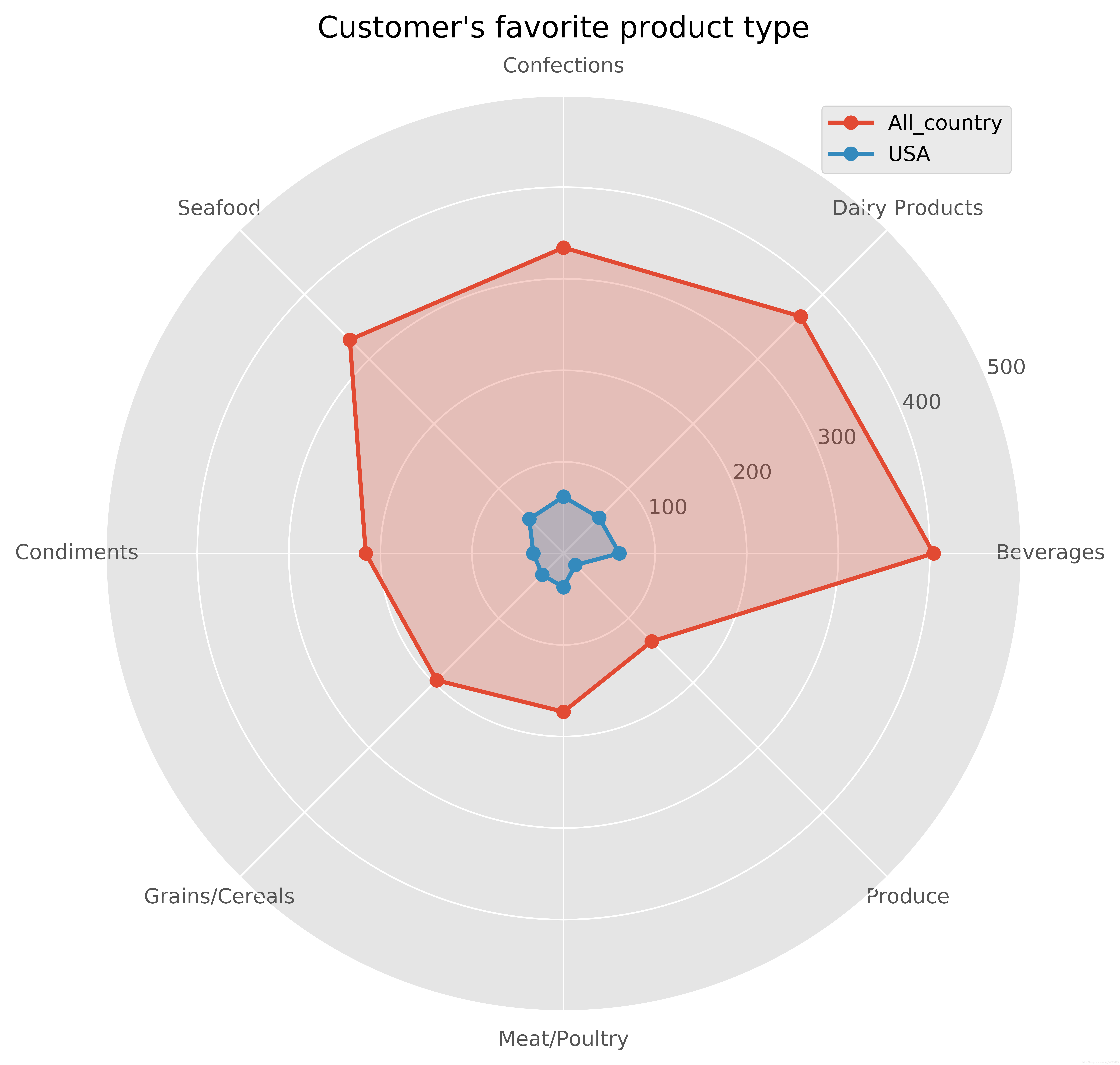
用 matplotlib 绘制雷达图
数据样式
CategoryName,USA_Category_count,ALL_Category_count
Beverages,61,404
Dairy Products,55,366
Confections,62,334
Seafood,53,330
Condiments,33,216
Grains/Cereals,33,196
Meat/Poultry,37,173
Produce,18,136
代码
import numpy as np
import matplotlib.pyplot as plt
#使用ggplot的绘图风格,这个类似于美化了,可以通过plt.style.available查看可选值,你会发现其它的风格真的丑。。。
plt.style.use('ggplot')
#构造数据
os.chdir(r'F:\学习文档\20190801-假期作业\实战数据')
cate_love = pd.read_csv(r'什么类型的商品最受客户欢迎.csv')
spead_cate_love = pd.read_csv(r'消费最多的国家客户最爱什么类型的商品.csv')values_1 = cate_love.Categorie_count
feature = cate_love.CategoryName
values_2 = spead_cate_love.Category_count   #usa#设置每个数据点的显示位置,在雷达图上用角度表示
angles = np.linspace(0, 2 * np.pi, len(values_1), endpoint=False)
#拼接数据首尾,使图形中线条封闭
values_1 = np.concatenate((values_1, [values_1[0]]))
values_2 = np.concatenate((values_2, [values_2[0]]))
angles = np.concatenate((angles, [angles[0]]))fig = plt.figure(figsize=(8,8))
ax = fig.add_subplot(111, polar=True)
ax.plot(angles, values_1, 'o-', linewidth=2, label="All_country")
ax.fill(angles, values_1, alpha=0.25)ax.plot(angles, values_2, 'o-', linewidth=2, label="USA")
ax.fill(angles, values_2, alpha=0.25)#设置图标上的角度划分刻度,为每个数据点处添加标签
ax.set_thetagrids(angles * 180 / np.pi, feature)
#设置雷达图的范围
ax.set_ylim(0, 500)
#添加网格线 loc属性有'upper right', 'upper left', 'lower left',
#'lower right', 'right', 'center left', 'center right', 'lower center', 'upper center', 'center'
plt.legend(loc='best')
plt.title("Customer's favorite product type")
ax.grid(True)
plt.savefig(r'F:\学习文档\20190801-假期作业\实战数据\什么类型的商品受客户喜爱--消费最多国家喜欢买什么类型的商品.png', dpi=1000, bbox_inches='tight')
plt.show()
结果
最后
自己目前只能做到这程度,任重道远。马上入职一个月了,晚上发工资,开心~继续加油