����Media Queries��CSS3�й�ý���ѯ�����ԣ�����CSS3 ֮ý���ѯMedia Queries�Ϳ��Խ���ý���ѯ�����ÿ����ͬ��ý����в�ͬ����ʽ��д����˵�е�Web��Ӧʽ���־Ϳ��Ժ���ѹ�����������ˡ��������Ǿ�һ��������CSS3 ֮ý���ѯMedia Queries�����֪ʶ�ɡ�
����һ��Media Query֮���뷽��
����1���ⲿ����
<link rel="stylesheet" type="text/css" href="../css/print.css" media="print" />
����2��@media����
@media screen{
ѡ����{
���ԣ�����值��
}
}
����3��xml��ʽ����
<?xml-stylesheet rel="stylesheet" media="screen" href="css/style.css" ��>
����4��@import��ʽ����
@import url("css/reset.css") screen;
@import url("css/print.css") print;
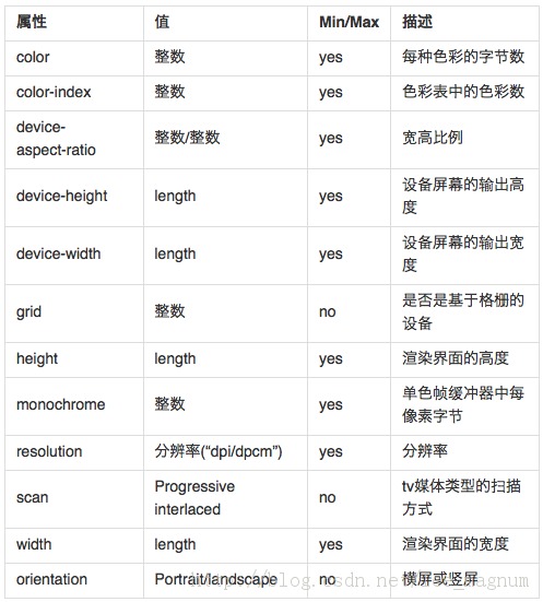
��������Media Query��Media�е�值
��������Media Query֮�������
�����ġ�Media Query֮ʵ��
����1��������Max Width�D�D����ĻС�ڻ����600pxʱ��������small.css��ʽ����ȾWebҳ��
<link rel="stylesheet" media="screen and (max-width:600px)" href="small.css" type="text/css" />
����2����С����Min Width�D�D����Ļ���ڻ����900pxʱ��������big.css��ʽ����ȾWebҳ��
<link rel="stylesheet" media="screen and (min-width:900px)" href="big.css" type="text/css" />
����3�����Media Queries�D�D����Ļ��600px-900px֮��ʱ����style.css��ʽ����Ⱦwebҳ��
<link rel="stylesheet" media="screen and (min-width:600px) and (max-width:900px)" href="style.css" type="text/css" />
����4���豸��Ļ���������Device Width�D�Diphone.css��ʽ����������豸����Ϊ480px������˵iPhone�ϵ���ʾ�������max-device-width��ָ�����豸��ʵ�ʷֱ��ʣ�Ҳ����ָ��������ֱ���
<link rel="stylesheet" media="screen and (max-device-width: 480px)" href="iphone.css" type="text/css" />
����5��iPhone4
<link rel="stylesheet" media="only screen and (-webkit-min-device-pixel-ratio: 2)" type="text/css" href="iphone4.css" />
����6��iPad�D�D������(portrait)ʱ����portrait.css����Ⱦҳ��;�ں���(landscape)ʱ����landscape.css����Ⱦҳ��
<link rel="stylesheet" media="all and (orientation:portrait)" href="portrait.css" type="text/css" />
<link rel="stylesheet" media="all and (orientation:landscape)" href="landscape.css"  type="text/css" />
����7��Android
<!--240px�Ŀ���--> <link rel="stylesheet" media="only screen and (max-device-width:240px)" href="android240.css" type="text/css" /> <!--360px�Ŀ���--> <link rel="stylesheet" media="only screen and (min-device-width:241px) and (max-device-width:360px)" href="android360.css" type="text/css" /> <!--480px�Ŀ���--> <link rel="stylesheet" media="only screen and (min-device-width:361px) and (max-device-width:480px)" href="android480.css" type="text/css" />
����8��not�ؼ����D�D�ų�ij���ƶ���ý������
<link rel="stylesheet" media="not print and (max-width: 1200px)" href="print.css" type="text/css" />
����9��only�ؼ���
����only������ij���ض���ý�����ͣ����������ų���֧��ý���ѯ�����������ʵonly�ܶ�ʱ������������Щ��֧��Media Query��ȴ֧��Media Type���豸������ʽ���ġ�����Ҫ�У�֧��ý������(Media Queries)���豸������������ʽ����ʱ�͵�only������;���ڲ�֧��ý������(Media Queries)����֧��ý������(Media Type)���豸�������ͻ������ʽ����Ϊ���ȶ�only������screen;���ⲻ֧��Media Qqueries��������������Ƿ�֧��only����ʽ�����ᱻ���á�
<link rel="stylesheet" media="only screen and (max-device-width:240px)" href="android240.css" type="text/css" />
����10�������D�Dstyle.css��ʽ�����ڿ���С�ڻ����480px���ֳ��豸�ϣ����߱�������Ļ���ȴ��ڻ����960px���豸��
<link rel="stylesheet" type="text/css" href="style.css" media="handheld and (max-width:480px), screen and (min-width:960px)" />
����11����ֹ��Ļ����
�������ƶ��豸������ϣ�ͨ��Ϊviewport meta��ǩ����user-scalable=no���Խ���������(zooming)���ܡ������������Ź��ܺ��û�ֻ�ܹ�����Ļ�������������վ����ȥ����ԭ��Ӧ�õĸо���ע�⣬���ַ�ʽ���Dz����Ƽ�������վʹ�ã�����Ҫ�����Լ����������!
<meta name="viewport" content="width=device-width, initial-scale=1.0, maximum-scale=1.0, user-scalable=no">
����CSS3 ֮ý���ѯMedia Query�Ľ��ܾ��������ˣ�ϣ����ҿ���֮�dz����ɵ��ܹ�����ý���ѯ���СС��CSS3���ԡ�