最近做了个项目,居然在一个小小的css问题上折腾了很久很是 纠结――外边距折叠的问题。今天难得清闲,就把这个问题研究了一下,才发现大有学问,所以写篇博文整理一下,以便更加牢记!
外边距折叠,指的是毗邻的两个或多个外边距 (margin) 在垂直方向会合并成一个外边距。
触发条件:
- 毗邻,没有被非空内容、padding、border 或 clear 分隔开的margin特性. 非空内容就是说这元素之间要么是兄弟关系或者父子关系
- 这些 margin 都处于普通流中,即非浮动元素,非定位元素
垂直方向外边距合并的计算
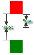
1) 参加折叠的margin都是正值:取其中 margin 较大的值为最终 margin 值。
<div style="height:50px; margin-bottom:50px; width:50px; background-color: red;">A</div>
<div style="height:50px; margin-top:100px; width:50px; background-color: green;">B</div>
示意图:
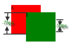
2). 参与折叠的 margin 都是负值:取的是其中绝对值较大的,然后,从 0 位置,负向位移。
<div style="height:100px; margin-bottom:-75px; width:100px; background-color: red;">A</div>
<div style="height:100px; margin-top:-50px; margin-left:50px; width:100px; background-color: green;">B</div>
示意图:
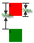
3). 参与折叠的 margin 中有正值,有负值:先取出负 margin 中绝对值中最大的,然后,和正 margin 值中最大的 margin 相加。
<div style="height:50px; margin-bottom:-50px; width:50px; background-color: red;">A</div>
<div style="height:50px; margin-top:100px; width:50px; background-color: green;">B</div>
示意图:
4). 相邻的 margin 要一起参与计算,不得分步计算
要注意,相邻的元素不一定非要是兄弟节点,父子节点也可以,即使不是兄弟父子节点也可以相邻。
而且,在计算时,相邻的 margin 要一起参与计算,不得分步计算。

<div style="margin:50px 0; background-color:green; width:50px;">
    <div style="margin:-60px 0;">
           <div style="margin:150px 0;">A</div>
    </div>
</div>//www.software8.co
<div style="margin:-100px 0; background-color:green; width:50px;">
    <div style="margin:-120px 0;">
           <div style="margin:200px 0;">B</div>
    </div>
</div>
错误的计算方式:算 A 和 B 之间的 margin,分别算 A 和其父元素的折叠,然后与其父元素的父元素的折叠,这个值算出来之后,应该是 90px。依此法算出 B 的为 80px;然后,A和B折叠,margin 为 90px。
请注意,多个 margin 相邻折叠成一个 margin,所以计算的时候,应该取所有相关的值一起计算,而不能分开分步来算。
以上例子中,A 和 B 之间的 margin 折叠产生的 margin,是6个相邻 margin 折叠的结果。将其 margin 值分为两组:
正值:50px,150px,200px
负值:-60px,-100px,-120px
根据有正有负时的计算规则,正值的最大值为 200px,负值中绝对值最大的是 -120px,所以,最终折叠后的 margin 应该是 200 + (-120) = 80px。
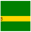
5). 浮动元素、inline-block 元素、绝对定位元素的 margin 不会和垂直方向上其他元素的 margin 折叠
<div style="margin-bottom:50px; width:50px; height:50px; background-color:green;">A</div>
<div style="margin-top:50px; width:100px; height:100px; background-color:green; float:left;">
    <div style="margin-top:50px; background-color:gold;">B</div>
</div>
示意图:
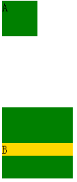
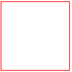
6). 创建了块级格式化上下文1的元素,不和它的子元素发生 margin 折叠
以 “overflow : hidden” 的元素为例:
<div style="margin-top:50px; width:100px; height:100px; background-color:green; overflow:hidden;">
    <div style="margin-top:50px; background-color:gold;">B</div>
</div>
若 B 和它的 "overflow:hidden" 包含块发生 margin 折叠的话,金色的条应该位于绿色块的最上方,否则,没有发生。
示意图:
7). 元素自身的 margin-bottom 和 margin-top 相邻时也会折叠
自身 margin-bottom 和 margin-top 相邻,只能是自身内容为空,垂直方向上 border、padding 为 0。
<div style="border:1px solid red; width:100px;">
    <div style="margin-top: 100px;margin-bottom: 50px;"></div>
</div>
以上代码运行后,我们讲得到的是红色边框的正方形,方框的宽高都应该是 100px,高度不应该是 150px。
示意图:
原文:http://www.heatpress123.net/cpzs/