分享一下我老师大神的人工智能教程!零基础,通俗易懂!http://blog.csdn.net/jiangjunshow
也欢迎大家转载本篇文章。分享知识,造福人民,实现我们中华民族伟大复兴!
转载请标明出处:
http://blog.csdn.net/lmj623565791/article/details/45303349;
本文出自:【张鸿洋的博客】
1、概述
随着Material Design的逐渐的普及,业内也有很多具有分享精神的伙伴翻译了material design specification ,中文翻译地址:Material Design 中文版。So,我们也开始Android 5.x相关的blog,那么首先了解的当然是其主题的风格以及app bar。
当然,5.x普及可能还需要一段时间,所以我们还是尽可能的去使用兼容包支持低版本的设备。
ps:本博客使用:
- compileSdkVersion 22
- buildToolsVersion “22.0.1”
- compile ‘com.android.support:appcompat-v7:22.1.1’
- 忽然发现ActionBarActivity被弃用了,推荐使用AppCompatActivity,相关blog地址:Android Support Library 22.1
2、Material Design的Theme
md的主题有:
- @android:style/Theme.Material (dark version)
- @android:style/Theme.Material.Light (light version)
- @android:style/Theme.Material.Light.DarkActionBar
与之对应的Compat Theme:
- Theme.AppCompat
- Theme.AppCompat.Light
- Theme.AppCompat.Light.DarkActionBar
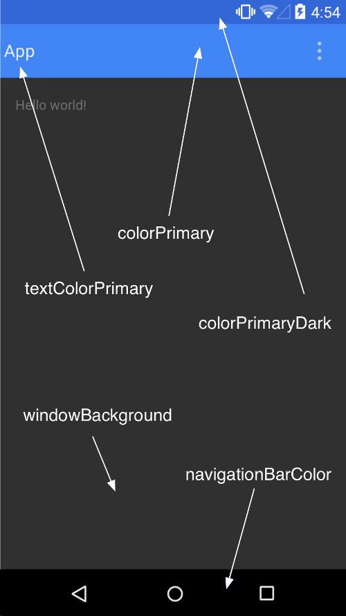
(1)个性化 Color Palette
我们可以根据我们的app的风格,去定制Color Palette(调色板),重点有以下几个属性:
<resources> <!-- Base application theme. --> <style name="AppBaseTheme" parent="Theme.AppCompat"> <!-- customize the color palette --> <item name="colorPrimary">@color/material_blue_500</item> <item name="colorPrimaryDark">@color/material_blue_700</item> <item name="colorAccent">@color/material_green_A200</item> </style></resources>
- 1
- 2
- 3
- 4
- 5
- 6
- 7
- 8
- 9
- 10
- 11
- colorPrimary 对应ActionBar的颜色。
- colorPrimaryDark对应状态栏的颜色
- colorAccent 对应EditText编辑时、RadioButton选中、CheckBox等选中时的颜色。
与之对应的图:
metarial design的theme允许我们去设置status bar的颜色,如果你项目的最小支持版本为5.0,那么你可以使用
android:Theme.Material,设置android:statusBarColor。当然了这种情况目前来说比较少,所以我们多数使用的是Theme.AppCompat,通过设置android:colorPrimaryDark.来设置status bar颜色。(ps:默认情况下,android:statusBarColor的值继承自android:colorPrimaryDark).
对于5.0以下的设备,目前colorPrimaryDark无法去个性化状态栏的颜色;底部的navagationBar可能也不一样,更别说设置颜色了。
下面写个简单的Demo去测试下。
(2)测试效果
values/styles.xml
<resources> <!-- Base application theme. --> <style name="AppTheme" parent="AppBaseTheme"> </style> <style name="AppBaseTheme" parent="Theme.AppCompat.Light"> <!-- customize the color palette --> <item name="colorPrimary">@color/material_blue_500</item> <item name="colorPrimaryDark">@color/material_blue_700</item> <item name="colorAccent">@color/material_green_A200</item> </style></resources>
- 1
- 2
- 3
- 4
- 5
- 6
- 7
- 8
- 9
- 10
- 11
- 12
- 13
- 14
- 15
- 16
- 17
- 18
- 19
- 20
- 21
values-v21/styles.xml
<resources> <style name="AppTheme" parent="AppBaseTheme"> <item name="android:statusBarColor">@color/material_blue_700</item> </style></resources>
- 1
- 2
- 3
- 4
- 5
- 6
- 7
- 8
- 9
values/colors.xml
<?xml version="1.0" encoding="utf-8"?><resources> <color name="material_blue_500">#009688</color> <color name="material_blue_700">#00796B</color> <color name="material_green_A200">#FD87A9</color></resources>
- 1
- 2
- 3
- 4
- 5
- 6
- 7
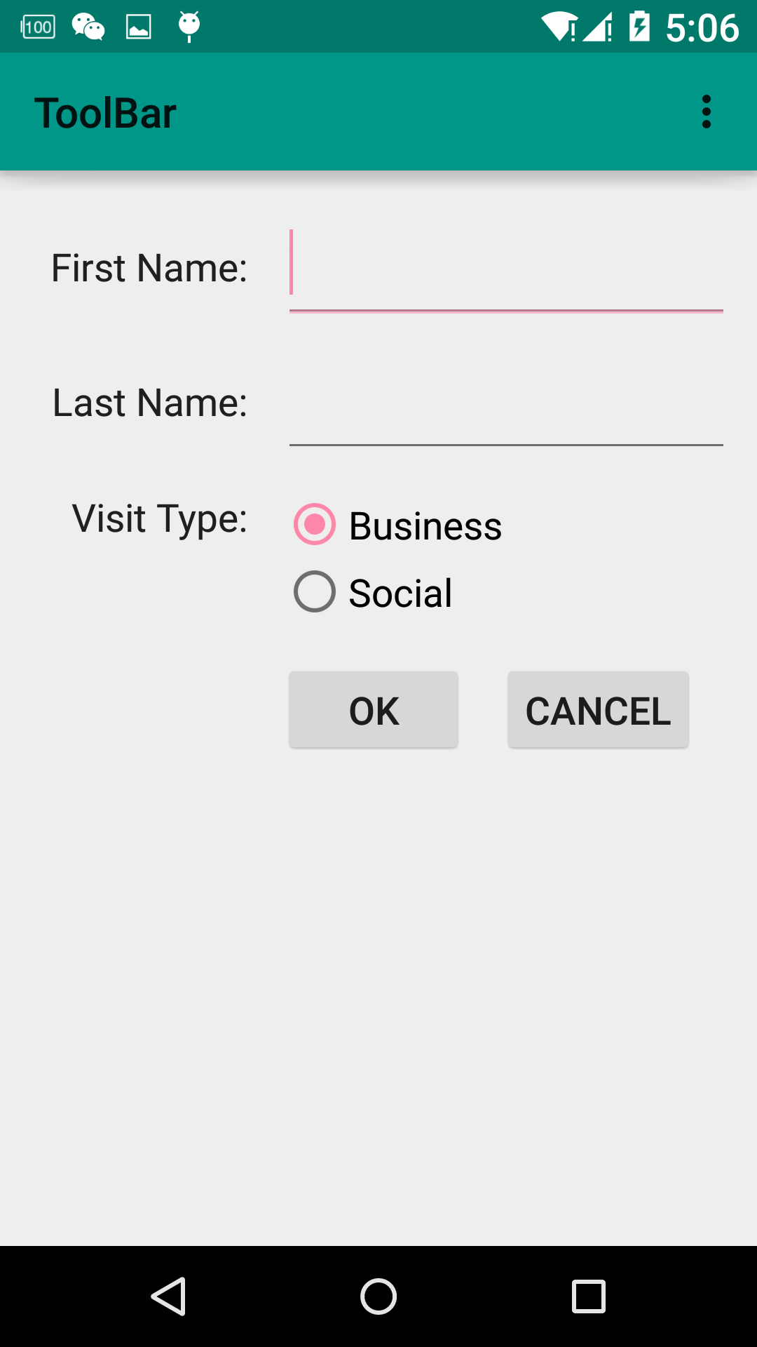
可以看到:colorAccent也就是图中的粉色,EditText正在输入时,RadioButton选中时的颜色。ps:5.0以下设备,状态栏颜色不会变化。
3、ToolBar的使用
众所周知,在使用ActionBar的时候,一堆的问题:这个文字能不能定制,位置能不能改变,图标的间距怎么控制神马的,由此暴露出了ActionBar设计的不灵活。为此官方提供了ToolBar,并且提供了supprot library用于向下兼容。Toolbar之所以灵活,是因为它其实就是一个ViewGroup,我们在使用的时候和普通的组件一样,在布局文件中声明。
(1)ToolBar的引入
既然准备用ToolBar,首先看看如何将其引入到app中。
1)隐藏原本的ActionBar
隐藏可以通过修改我们继承的主题为:Theme.AppCompat.Light.NoActionBar,当然也可以通过设置以下属性完成:
<item name="windowActionBar">false</item><item name="android:windowNoTitle">true</item>
- 1
- 2
我们这里选择前者:
<style name="AppBaseTheme" parent="Theme.AppCompat.Light.NoActionBar"> <!-- customize the color palette --> <item name="colorPrimary">@color/material_blue_500</item> <item name="colorPrimaryDark">@color/material_blue_700</item> <item name="colorAccent">@color/material_green_A200</item> </style>
- 1
- 2
- 3
- 4
- 5
- 6
- 7
- 8
2)在布局文件中声明
<LinearLayout xmlns:android="http://schemas.android.com/apk/res/android" android:layout_width="match_parent" android:orientation="vertical" android:layout_height="match_parent" xmlns:app="http://schemas.android.com/apk/res-auto"> <android.support.v7.widget.Toolbar android:id="@+id/id_toolbar" android:layout_height="wrap_content" android:layout_width="match_parent" /> <android.support.v7.widget.GridLayout android:layout_width="wrap_content" android:layout_height="wrap_content" android:layout_gravity="center_horizontal" app:useDefaultMargins="true" app:columnCount="3"> <TextView android:text="First Name:" app:layout_gravity="right" /> <EditText android:ems="10" app:layout_columnSpan="2" /> <TextView android:text="Last Name:" app:layout_column="0" app:layout_gravity="right" /> <EditText android:ems="10" app:layout_columnSpan="2" /> <TextView android:text="Visit Type:" app:layout_column="0" app:layout_gravity="right" /> <RadioGroup app:layout_columnSpan="2"> <RadioButton android:layout_width="wrap_content" android:layout_height="wrap_content" android:text="Business" /> <RadioButton android:layout_width="wrap_content" android:layout_height="wrap_content" android:text="Social" /> </RadioGroup> <Button android:text="Ok" app:layout_column="1" /> <Button android:text="Cancel" app:layout_column="2" /> </android.support.v7.widget.GridLayout></LinearLayout>
- 1
- 2
- 3
- 4
- 5
- 6
- 7
- 8
- 9
- 10
- 11
- 12
- 13
- 14
- 15
- 16
- 17
- 18
- 19
- 20
- 21
- 22
- 23
- 24
- 25
- 26
- 27
- 28
- 29
- 30
- 31
- 32
- 33
- 34
- 35
- 36
- 37
- 38
- 39
- 40
- 41
- 42
- 43
- 44
- 45
- 46
- 47
- 48
- 49
- 50
- 51
- 52
- 53
- 54
- 55
- 56
- 57
- 58
- 59
- 60
- 61
- 62
- 63
- 64
- 65
- 66
- 67
- 68
- 69
- 70
- 71
- 72
ok,这里我们也贴出来上面图片的效果的xml,使用GridLayout实现的,有兴趣的可以研究下。可以看到我们在布局文件中定义了ToolBar。
3)代码中设定
public class MainActivity extends AppCompatActivity {
         @Override    protected void onCreate(Bundle savedInstanceState) {        super.onCreate(savedInstanceState);        setContentView(R.layout.activity_main);        Toolbar toolbar = (Toolbar) findViewById(R.id.id_toolbar);        setSupportActionBar(toolbar);    }
- 1
- 2
- 3
- 4
- 5
- 6
- 7
- 8
- 9
- 10
ok,基本就是先隐藏ActionBar,然后在布局文件中声明,最后代码中设定一下。现在看一下效果图:
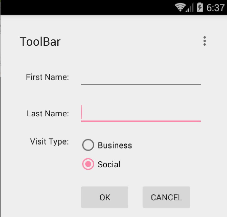
可以看到我们的ToolBar显示出来了,默认的Title为ToolBar,但是这个样式实在是不敢恭维,下面看我们如何定制它。
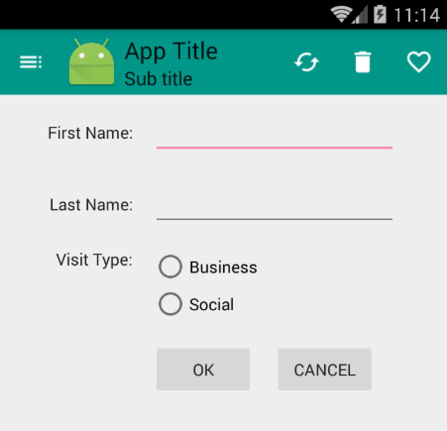
(2)定制ToolBar
首先给它一个nice的背景色,还记得前面的colorPrimary么,用于控制ActionBar的背景色的。当然这里我们的ToolBar就是一个普通的ViewGroup在布局中,所以我们直接使用background就好,值可以为:?attr/colorPrimary使用主题中定义的值。
ToolBar中包含Nav Icon , Logo , Title , Sub Title , Menu Items 。
我们可以通过代码设置上述ToolBar中的控件:
@Override protected void onCreate(Bundle savedInstanceState) { super.onCreate(savedInstanceState); setContentView(R.layout.activity_main); Toolbar toolbar = (Toolbar) findViewById(R.id.id_toolbar); // App Logo toolbar.setLogo(R.mipmap.ic_launcher); // Title toolbar.setTitle("App Title"); // Sub Title toolbar.setSubtitle("Sub title"); setSupportActionBar(toolbar); //Navigation Icon toolbar.setNavigationIcon(R.drawable.ic_toc_white_24dp); }
- 1
- 2
- 3
- 4
- 5
- 6
- 7
- 8
- 9
- 10
- 11
- 12
- 13
- 14
- 15
- 16
- 17
- 18
- 19
可选方案当然如果你喜欢,也可以在布局文件中去设置部分属性:
<android.support.v7.widget.Toolbar android:id="@+id/id_toolbar" app:title="App Title" app:subtitle="Sub Title" app:navigationIcon="@drawable/ic_toc_white_24dp" android:layout_height="wrap_content" android:minHeight="?attr/actionBarSize" android:layout_width="match_parent" android:background="?attr/colorPrimary"/>
- 1
- 2
- 3
- 4
- 5
- 6
- 7
- 8
- 9
至于Menu Item,依然支持在menu/menu_main.xml去声明,然后复写onCreateOptionsMenu和onOptionsItemSelected即可。
可选方案也可以通过toolbar.setOnMenuItemClickListener实现点击MenuItem的回调。
toolbar.setOnMenuItemClickListener(new Toolbar.OnMenuItemClickListener() { @Override public boolean onMenuItemClick(MenuItem item) { return false; } });
- 1
- 2
- 3
- 4
- 5
- 6
效果图:
关于字体的样式,可以在布局文件设置属性app:titleTextAppearance、app:subtitleTextAppearance或者代码setTitleTextAppearance、setSubTitleTextAppearance设置。
4、实战
简单介绍了Toolbar以后呢,我们决定做点有意思的事,整合ToolBar,DrawerLayout,ActionBarDrawerToggle写个实用的例子,效果图如下:
ok,简单处理了下横纵屏幕的切换。接下来看代码实现。
- 大致思路
整体实现还是比较容易的,首先需要引入DrawerLayout(如果你对DrawerLayout不了解,可以参考
Android DrawerLayout 高仿QQ5.2双向侧滑菜单),然后去初始化mActionBarDrawerToggle,mActionBarDrawerToggle实际上是个DrawerListener,设置mDrawerLayout.setDrawerListener(mActionBarDrawerToggle);就已经能够实现上面点击Nav Icon切换效果了。当然了细节还是挺多的。
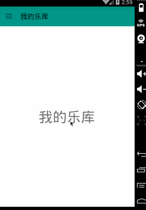
我们的效果图,左侧菜单为Fragment,内容区域为Fragment,点击左侧菜单切换内容区域的Fragment即可。关于Fragment的知识,可以查看:Android Fragment 你应该知道的一切
- 布局文件
activity_main.xml
<LinearLayout xmlns:android="http://schemas.android.com/apk/res/android" android:layout_width="match_parent" android:orientation="vertical" android:layout_height="match_parent" android:background="#ffffffff" xmlns:app="http://schemas.android.com/apk/res-auto"> <!--app:subtitle="Sub Title"--> <android.support.v7.widget.Toolbar android:id="@+id/id_toolbar" app:title="App Title" app:navigationIcon="@drawable/ic_toc_white_24dp" android:layout_height="wrap_content" android:minHeight="?attr/actionBarSize" android:layout_width="match_parent" android:background="?attr/colorPrimary" /> <android.support.v4.widget.DrawerLayout android:id="@+id/id_drawerlayout" android:layout_width="match_parent" android:layout_height="match_parent"> <FrameLayout android:id="@+id/id_content_container" android:layout_width="match_parent" android:layout_height="match_parent"></FrameLayout> <FrameLayout android:id="@+id/id_left_menu_container" android:layout_width="match_parent" android:layout_height="match_parent" android:layout_gravity="left" android:background="#ffffffff"></FrameLayout> </android.support.v4.widget.DrawerLayout></LinearLayout>
- 1
- 2
- 3
- 4
- 5
- 6
- 7
- 8
- 9
- 10
- 11
- 12
- 13
- 14
- 15
- 16
- 17
- 18
- 19
- 20
- 21
- 22
- 23
- 24
- 25
- 26
- 27
- 28
- 29
- 30
- 31
- 32
- 33
- 34
- 35
- 36
- 37
- 38
- 39
- 40
- 41
DrawerLayout中包含两个FrameLayout,分别放内容区域和左侧菜单的Fragment。
- LeftMenuFragment
package com.zhy.toolbar;import android.os.Bundle;import android.support.annotation.Nullable;import android.support.v4.app.ListFragment;import android.view.LayoutInflater;import android.view.View;import android.view.ViewGroup;import android.widget.ListView;/** * Created by zhy on 15/4/26. */public class LeftMenuFragment extends ListFragment {
         private static final int SIZE_MENU_ITEM = 3;    private MenuItem[] mItems = new MenuItem[SIZE_MENU_ITEM];    private LeftMenuAdapter mAdapter;    private LayoutInflater mInflater;    @Override    public void onCreate(@Nullable Bundle savedInstanceState) {        super.onCreate(savedInstanceState);        mInflater = LayoutInflater.from(getActivity());        MenuItem menuItem = null;        for (int i = 0; i < SIZE_MENU_ITEM; i++) {            menuItem = new MenuItem(getResources().getStringArray(R.array.array_left_menu)[i], false, R.drawable.music_36px, R.drawable.music_36px_light);            mItems[i] = menuItem;        }    }    @Override    public View onCreateView(LayoutInflater inflater, ViewGroup container, Bundle savedInstanceState) {        return super.onCreateView(inflater, container, savedInstanceState);    }    @Override    public void onViewCreated(View view, @Nullable Bundle savedInstanceState) {        super.onViewCreated(view, savedInstanceState);        setListAdapter(mAdapter = new LeftMenuAdapter(getActivity(), mItems));    }    @Override    public void onListItemClick(ListView l, View v, int position, long id) {        super.onListItemClick(l, v, position, id);        if (mMenuItemSelectedListener != null) {            mMenuItemSelectedListener.menuItemSelected(((MenuItem) getListAdapter().getItem(position)).text);        }        mAdapter.setSelected(position);    }    //选择回调的接口    public interface OnMenuItemSelectedListener {
             void menuItemSelected(String title);    }    private OnMenuItemSelectedListener mMenuItemSelectedListener;    public void setOnMenuItemSelectedListener(OnMenuItemSelectedListener menuItemSelectedListener) {        this.mMenuItemSelectedListener = menuItemSelectedListener;    }}
- 1
- 2
- 3
- 4
- 5
- 6
- 7
- 8
- 9
- 10
- 11
- 12
- 13
- 14
- 15
- 16
- 17
- 18
- 19
- 20
- 21
- 22
- 23
- 24
- 25
- 26
- 27
- 28
- 29
- 30
- 31
- 32
- 33
- 34
- 35
- 36
- 37
- 38
- 39
- 40
- 41
- 42
- 43
- 44
- 45
- 46
- 47
- 48
- 49
- 50
- 51
- 52
- 53
- 54
- 55
- 56
- 57
- 58
- 59
- 60
- 61
- 62
- 63
- 64
- 65
- 66
- 67
- 68
- 69
- 70
- 71
- 72
- 73
- 74
- 75
- 76
继承自ListFragment,主要用于展示各个Item,提供了一个选择Item的回调,这个需要在Activity中去注册处理。
- LeftMenuAdapter
package com.zhy.toolbar;import android.content.Context;import android.graphics.Color;import android.view.LayoutInflater;import android.view.View;import android.view.ViewGroup;import android.widget.ArrayAdapter;import android.widget.ImageView;import android.widget.TextView;/** * Created by zhy on 15/4/26. */public class LeftMenuAdapter extends ArrayAdapter<MenuItem> {
         private LayoutInflater mInflater;    private int mSelected;    public LeftMenuAdapter(Context context, MenuItem[] objects) {        super(context, -1, objects);        mInflater = LayoutInflater.from(context);    }    @Override    public View getView(int position, View convertView, ViewGroup parent) {        if (convertView == null) {            convertView = mInflater.inflate(R.layout.item_left_menu, parent, false);        }        ImageView iv = (ImageView) convertView.findViewById(R.id.id_item_icon);        TextView title = (TextView) convertView.findViewById(R.id.id_item_title);        title.setText(getItem(position).text);        iv.setImageResource(getItem(position).icon);        convertView.setBackgroundColor(Color.TRANSPARENT);        if (position == mSelected) {            iv.setImageResource(getItem(position).iconSelected);            convertView.setBackgroundColor(getContext().getResources().getColor(R.color.state_menu_item_selected));        }        return convertView;    }    public void setSelected(int position) {        this.mSelected = position;        notifyDataSetChanged();    }}package com.zhy.toolbar;public class MenuItem {
         public MenuItem(String text, boolean isSelected, int icon, int iconSelected) {        this.text = text;        this.isSelected = isSelected;        this.icon = icon;        this.iconSelected = iconSelected;    }    boolean isSelected;    String text;    int icon;    int iconSelected;}
- 1
- 2
- 3
- 4
- 5
- 6
- 7
- 8
- 9
- 10
- 11
- 12
- 13
- 14
- 15
- 16
- 17
- 18
- 19
- 20
- 21
- 22
- 23
- 24
- 25
- 26
- 27
- 28
- 29
- 30
- 31
- 32
- 33
- 34
- 35
- 36
- 37
- 38
- 39
- 40
- 41
- 42
- 43
- 44
- 45
- 46
- 47
- 48
- 49
- 50
- 51
- 52
- 53
- 54
- 55
- 56
- 57
- 58
- 59
- 60
- 61
- 62
- 63
- 64
- 65
- 66
- 67
- 68
- 69
- 70
- 71
- 72
- 73
- 74
- 75
- 76
- 77
Adapter没撒说的~~提供了一个setSection方法用于设置选中Item的样式什么的。
接下来看ContentFragment,仅仅只是一个TextView而已,所以代码也比较easy。
package com.zhy.toolbar;import android.os.Bundle;import android.support.annotation.Nullable;import android.support.v4.app.Fragment;import android.text.TextUtils;import android.view.Gravity;import android.view.LayoutInflater;import android.view.View;import android.view.ViewGroup;import android.widget.TextView;/** * Created by zhy on 15/4/26. */public class ContentFragment extends Fragment {
         public static final String KEY_TITLE = "key_title";    private String mTitle;    public static ContentFragment newInstance(String title) {        ContentFragment fragment = new ContentFragment();        Bundle bundle = new Bundle();        bundle.putString(KEY_TITLE, title);        fragment.setArguments(bundle);        return fragment;    }    @Nullable    @Override    public View onCreateView(LayoutInflater inflater, @Nullable ViewGroup container,                             @Nullable Bundle savedInstanceState) {        TextView tv = new TextView(getActivity());        String title = (String) getArguments().get(KEY_TITLE);        if (!TextUtils.isEmpty(title))        {            tv.setGravity(Gravity.CENTER);            tv.setTextSize(40);            tv.setText(title);        }        return tv;    }}
- 1
- 2
- 3
- 4
- 5
- 6
- 7
- 8
- 9
- 10
- 11
- 12
- 13
- 14
- 15
- 16
- 17
- 18
- 19
- 20
- 21
- 22
- 23
- 24
- 25
- 26
- 27
- 28
- 29
- 30
- 31
- 32
- 33
- 34
- 35
- 36
- 37
- 38
- 39
- 40
- 41
- 42
- 43
- 44
- 45
- 46
提供newInstance接收一个title参数去实例化它。
最后就是我们的MainActivity了,负责管理各种Fragment。
- MainActivity
package com.zhy.toolbar;import android.os.Bundle;import android.support.v4.app.Fragment;import android.support.v4.app.FragmentManager;import android.support.v4.app.FragmentTransaction;import android.support.v4.widget.DrawerLayout;import android.support.v7.app.ActionBarDrawerToggle;import android.support.v7.app.AppCompatActivity;import android.support.v7.widget.Toolbar;import android.text.TextUtils;import android.view.Gravity;import java.util.List;public class MainActivity extends AppCompatActivity {
         private ActionBarDrawerToggle mActionBarDrawerToggle;    private DrawerLayout mDrawerLayout;    private Toolbar mToolbar;    private LeftMenuFragment mLeftMenuFragment;    private ContentFragment mCurrentFragment;    private String mTitle;    private static final String TAG = "com.zhy.toolbar";    private static final String KEY_TITLLE = "key_title";    @Override    protected void onCreate(Bundle savedInstanceState) {        super.onCreate(savedInstanceState);        setContentView(R.layout.activity_main);        initToolBar();        initViews();        //恢复title        restoreTitle(savedInstanceState);        FragmentManager fm = getSupportFragmentManager();        //查找当前显示的Fragment        mCurrentFragment = (ContentFragment) fm.findFragmentByTag(mTitle);        if (mCurrentFragment == null) {            mCurrentFragment = ContentFragment.newInstance(mTitle);            fm.beginTransaction().add(R.id.id_content_container, mCurrentFragment, mTitle).commit();        }        mLeftMenuFragment = (LeftMenuFragment) fm.findFragmentById(R.id.id_left_menu_container);        if (mLeftMenuFragment == null) {            mLeftMenuFragment = new LeftMenuFragment();            fm.beginTransaction().add(R.id.id_left_menu_container, mLeftMenuFragment).commit();        }        //隐藏别的Fragment,如果存在的话        List<Fragment> fragments = fm.getFragments();        if (fragments != null)            for (Fragment fragment : fragments) {                if (fragment == mCurrentFragment || fragment == mLeftMenuFragment) continue;                fm.beginTransaction().hide(fragment).commit();            }        //设置MenuItem的选择回调        mLeftMenuFragment.setOnMenuItemSelectedListener(new LeftMenuFragment.OnMenuItemSelectedListener() {            @Override            public void menuItemSelected(String title) {                FragmentManager fm = getSupportFragmentManager();                ContentFragment fragment = (ContentFragment) getSupportFragmentManager().findFragmentByTag(title);                if (fragment == mCurrentFragment) {                    mDrawerLayout.closeDrawer(Gravity.LEFT);                    return;                }                FragmentTransaction transaction = fm.beginTransaction();                transaction.hide(mCurrentFragment);                if (fragment == null) {                    fragment = ContentFragment.newInstance(title);                    transaction.add(R.id.id_content_container, fragment, title);                } else {                    transaction.show(fragment);                }                transaction.commit();                mCurrentFragment = fragment;                mTitle = title;                mToolbar.setTitle(mTitle);                mDrawerLayout.closeDrawer(Gravity.LEFT);            }        });    }    private void restoreTitle(Bundle savedInstanceState) {        if (savedInstanceState != null)            mTitle = savedInstanceState.getString(KEY_TITLLE);        if (TextUtils.isEmpty(mTitle)) {            mTitle = getResources().getStringArray(                    R.array.array_left_menu)[0];        }        mToolbar.setTitle(mTitle);    }    @Override    protected void onSaveInstanceState(Bundle outState) {        super.onSaveInstanceState(outState);        outState.putString(KEY_TITLLE, mTitle);    }    private void initToolBar() {        Toolbar toolbar = mToolbar = (Toolbar) findViewById(R.id.id_toolbar);        // App Logo        // toolbar.setLogo(R.mipmap.ic_launcher);        // Title        toolbar.setTitle(getResources().getStringArray(R.array.array_left_menu)[0]);        // Sub Title        // toolbar.setSubtitle("Sub title");//        toolbar.setTitleTextAppearance();        setSupportActionBar(toolbar);        //Navigation Icon        toolbar.setNavigationIcon(R.drawable.ic_toc_white_24dp);        /*        toolbar.setOnMenuItemClickListener(new Toolbar.OnMenuItemClickListener() {            @Override            public boolean onMenuItemClick(MenuItem item) {                return false;            }        });*/    }    private void initViews() {        mDrawerLayout = (DrawerLayout) findViewById(R.id.id_drawerlayout);        mActionBarDrawerToggle = new ActionBarDrawerToggle(this,                mDrawerLayout, mToolbar, R.string.open, R.string.close);        mActionBarDrawerToggle.syncState();        mDrawerLayout.setDrawerListener(mActionBarDrawerToggle);    }}
- 1
- 2
- 3
- 4
- 5
- 6
- 7
- 8
- 9
- 10
- 11
- 12
- 13
- 14
- 15
- 16
- 17
- 18
- 19
- 20
- 21
- 22
- 23
- 24
- 25
- 26
- 27
- 28
- 29
- 30
- 31
- 32
- 33
- 34
- 35
- 36
- 37
- 38
- 39
- 40
- 41
- 42
- 43
- 44
- 45
- 46
- 47
- 48
- 49
- 50
- 51
- 52
- 53
- 54
- 55
- 56
- 57
- 58
- 59
- 60
- 61
- 62
- 63
- 64
- 65
- 66
- 67
- 68
- 69
- 70
- 71
- 72
- 73
- 74
- 75
- 76
- 77
- 78
- 79
- 80
- 81
- 82
- 83
- 84
- 85
- 86
- 87
- 88
- 89
- 90
- 91
- 92
- 93
- 94
- 95
- 96
- 97
- 98
- 99
- 100
- 101
- 102
- 103
- 104
- 105
- 106
- 107
- 108
- 109
- 110
- 111
- 112
- 113
- 114
- 115
- 116
- 117
- 118
- 119
- 120
- 121
- 122
- 123
- 124
- 125
- 126
- 127
- 128
- 129
- 130
- 131
- 132
- 133
- 134
- 135
- 136
- 137
- 138
- 139
- 140
- 141
- 142
- 143
- 144
- 145
- 146
- 147
- 148
- 149
- 150
- 151
- 152
- 153
- 154
- 155
- 156
- 157
- 158
- 159
- 160
- 161
内容区域的切换是通过Fragment hide和show实现的,毕竟如果用replace,如果Fragment的view结构比较复杂,可能会有卡顿。当然了,注意每个Fragment占据的内存情况,如果内存不足,可能需要改变实现方式。
对于旋转屏幕或者应用长时间置于后台,Activity重建的问题,做了简单的处理。
对了,写布局的时候,可以尽可能的去考虑 Material design 的规范。
5、参考资料
- Using the Material Theme
- Android Support Library 22.1
- Material design
源码下载
群号: 264950424
微信公众号:hongyangAndroid
(欢迎关注,第一时间推送博文信息)

给我老师的人工智能教程打call!http://blog.csdn.net/jiangjunshow