本文接上一篇继续来介绍企业级开发中后台管理页面的制作。
一般来说,后台管理系统的登录后页面就是系统的主页,这个主页的显示效果是不变的,就是在这个页面上有导航按钮和导航树,仅仅变化的是主面板上的一个iframe。这就是比较传统的做法,也比较简单。我们沿用这一习惯,稍微添加一些效果。首先来看一下页面框架:
<!DOCTYPE html>
<html>
<head>
	<title>Home Page</title>
	<meta http-equiv="content-type" content="text/html;charset=UTF-8">
	<link rel="stylesheet" type="text/css" href="css/index.css" />
</head>
<body>
<div id="wrapper">
	<div id="header">
		<div id="logo">LOGO</div>
		<div id="title">后台管理系统</div>
		<div id="menu">
		</div>
		<div id="user_info">
			<div id="welcome">欢迎 Nan Lei 使用本系统</div>
			<div id="logout">安全退出</div>
		</div>
	</div>
</div>
</body>
</html>
页面元数据的声明就不多说了,页面背景我们仍然使用渐变的恬静的蓝色。在header中我们设置有Logo位置,title位置,menu位置和user_info位置。其中的menu下会设置详细的菜单信息。那么对应的CSS为:
* {
    background: none repeat scroll 0 0 transparent;
    border: 0 none;
    margin: 0;
    padding: 0;
    vertical-align: baseline;
}
body{
    min-height:600px;
    min-width:1280px;
	overflow-y:hidden;
}
#wrapper {
    background-image: -moz-linear-gradient(top,#77D1F6, #2F368F);
    background-image:-webkit-gradient(linear, left top, left bottom, color-stop(0, #77D1F6),color-stop(1, #2F368F));
    font-family: "lucida Grande",Tahoma,Arial;
    font-size: 12px;
    overflow: hidden;
    height:100%;
    width:100%;
    height:100%;
}
#header {
    float: left;
    height: 62px;
    position: relative;
    width: 100%;
    z-index: 10;
	text-align:center;
}
#logo {
    float: left;
    height: 38px;
	line-height:38px;
	vertical-align:middle;
    margin: 15px 0 0 1%;
    width: 60px;
}
#title {
    float: left;
    height: 38px;
	line-height:38px;
	vertical-align:middle;
    margin: 15px 0 0 1%;
    width: 260px;
	font-family:微软雅黑;
	font-size:18px;
	font-weight:bold;
	text-align:center;
}
#menu{
	position:absolute;
	left:50%;
	margin-top:15px;
	margin-left:-300px;
    float: float;
    height: 38px;
	width:615px;
	line-height:38px;
	vertical-align:middle;
	text-align:center;
    border-radius: 8px;
    background-color:#000000;
    opacity:0.5;
}
#user_info {
    height: 35px;
	line-height:35px;
	vertical-align:middle;
    position: relative;
	float:right;
	margin-top:15px;
	margin-right:15px;
	width:240px;
    font-weight:bold;
	font-size:14px;
}
#welcome{
    position: relative;
	float:left;
}
#logout{
    position: relative;
	float:right;
}
设置的信息都比较简单,没什么多说的,主要是body中设置的最小宽度和最小高度,这需要根据需求去自行调整。下面来看看菜单的设置:
			<div id="menu_container">
				<ul id="menu_items">
					<li class="menu_item on" style="border-radius:8px 0 0 8px" onmouseout="this.style.backgroundColor=''" onmouseover="this.style.backgroundColor='#77D1F6';this.style.borderRadius='8px 0 0 8px'"><a>系统管理</a></li>
					<li class="menu_item" onmouseout="this.style.backgroundColor='';this.style.fontWeight='normal'" onmouseover="this.style.backgroundColor='#77D1F6';this.style.fontWeight='bold'"><a>用户管理</a></li>
					<li class="menu_item" onmouseout="this.style.backgroundColor='';this.style.fontWeight='normal'" onmouseover="this.style.backgroundColor='#77D1F6';this.style.fontWeight='bold'"><a>新闻管理</a></li>
					<li class="menu_item" onmouseout="this.style.backgroundColor='';this.style.fontWeight='normal'" onmouseover="this.style.backgroundColor='#77D1F6';this.style.fontWeight='bold'"><a>网盘管理</a></li>
					<li class="menu_item" onmouseout="this.style.backgroundColor='';this.style.fontWeight='normal'" onmouseover="this.style.backgroundColor='#77D1F6';this.style.fontWeight='bold'"><a>相册管理</a></li>
					<li class="menu_item" style="border-radius:8px 0 0 8px;border:0px;" onmouseout="this.style.backgroundColor='';this.style.fontWeight='normal'" onmouseover="this.style.backgroundColor='#77D1F6';this.style.borderRadius='0 8px 8px 0';this.style.fontWeight='bold'"><a>邮件管理</a></li>
				</ul>
			</div>
我们编写了ul和li才存放菜单项,先不看外部CSS,嵌入的CSS中包含了两边的圆角矩形设置。然后就是javascript脚本,主要控制鼠标的移入和移出,也就是设置一下这两个事件的样式,主要是颜色和字体的变化,下面是CSS:
#menu_container{
    position:relative;
	margin:2px;
	height: 34px;
	line-height:34px;
    vertical-align:middle;
    border-radius: 8px;
    background-image: -moz-linear-gradient(top,#EBEBEB, #BFBFBF);
    background-image: -webkit-gradient(linear, left top, left bottom, color-stop(0, #EBEBEB),color-stop(1, #BFBFBF));
}
#menu_items{
	list-style:none;
	line-height: normal;
	height: 34px;
	line-height:34px;
	vertical-align:middle;
	font-size:14px;
	border:2px solid solid;
	border-right-style:groove;
}
.menu_item{
	display: list-item;
	float:left;
	width:100px;
	border-right:2px solid #F6F6F6;
	border-right-style:groove;
	cursor:pointer;
}
.on{
	display: list-item;
	float:left;
	width:100px;
	background:#77D1F6;
	font-weight:bold;
}
.menu_item a{
	height: 34px;
	line-height:34px;
	display:block;
}
现在来看一下效果:

我们看到背景并没有是全屏的,仅仅出现在了header上,不用担心,我们后面要设置页面的自适应效果。下面就是页面的剩余元素了:
	<div id="navigator">
		<iframe src="tree.html"></iframe>
        </div>
	<div id="main">
		<iframe name="MainFrame" src="main.html"></iframe>
	</div>
	<div id="footer">Copyright ? 2009-2011 All Rights Reserved Powered By Nan Lei</div>
很容易看出,navigator是导航树,main就是主面板的iframe,footer是一些版权信息了,加上之后,我们来看一下CSS:
#navigator{
    position:relative;
    float:left;
    width:200px;
    margin:5px 2px 5px 2px;
    left:5px;
    border-color: #77D1F6;
    border-width: 2px;
    border-style: solid;
    border-radius: 12px;
    -moz-box-shadow: 6px 6px 12px #282828;
    -webkit-box-shadow: 6px 6px 12px #282828;
}
#main{
    position:relative;
    float:left;
    width: 80%;
    margin:5px;
    left:5px;
    border-color: #77D1F6;
    border-width: 2px;
    border-style: solid;
    border-radius: 12px 12px;
    -moz-box-shadow: 6px 6px 12px #282828;
    -webkit-box-shadow: 6px 6px 12px #282828;
}
iframe{
    height:100%;
    width:100%;
    background:#FFF;
    position:relative;
    border-radius:12px;
    overflow:hidden;
}
这些CSS也很简单,加上之后,我们来看一下效果:

也不是很好看,还是挤在了一起,只要加入下面的脚本段就可以调整了:
<script type="text/javascript">
function screenAdapter(){
	document.getElementById('footer').style.top=document.documentElement.scrollTop+document.documentElement.clientHeight- document.getElementById('footer').offsetHeight+"px";
		document.getElementById('navigator').style.height=document.documentElement.clientHeight-100+"px";
		document.getElementById('main').style.height=document.documentElement.clientHeight-100+"px";
		document.getElementById('main').style.width=window.screen.width-230+"px";
}

window.onscroll=function(){screenAdapter()};
window.onresize=function(){screenAdapter()};
window.onload=function(){screenAdapter()};
</script>
脚本中的像素调整可以根据需要自行进行,我们来看一下最终的显示效果:
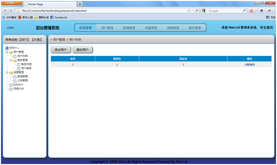
其中导航树的制作这里不再详细介绍,请参考之前的相关文章,主面板的内容的设计也不是什么难事,请参考附件中的代码。
本部分内容就介绍完了,欢迎交流,希望对使用者有用。
番外篇-给页面加把锁,点击查看
1 楼
matt911
2011-10-02
很喜欢这样的风格!~~很清爽哦
2 楼
shaohaiz141
2011-10-12
哈哈.很不错哦~!很喜欢.....顶!~~~
3 楼
weir2009
2011-10-24
还是有问题左右div不在一行。
4 楼
sarin
2011-10-24
weir2009 写道
还是有问题左右div不在一行。
调整js方法中的像素值,或者本身限制的像素值即可。不能使用不支持HTML5和CSS3的浏览器
5 楼
weir2009
2011-10-25
sarin 写道
weir2009 写道
还是有问题左右div不在一行。
调整js方法中的像素值,或者本身限制的像素值即可。不能使用不支持HTML5和CSS3的浏览器
谷歌浏览器也不行呀。我的19存的显示器,浏览器最大时才没有问题,浏览器只要放小一点就不行了,div就对不齐了。
6 楼
weir2009
2011-10-25
document.getElementById('main').style.width=document.documentElement.clientWidth-230+"px";
你把这个写错了。
你把这个写错了。
7 楼
TreeLin
2012-02-10
真不错 顶下
8 楼
jiangsoft
2012-04-24
真不错 顶下