Matplotlib
什么是matplolib?
Matplotlib是一个Python 2D绘图库,可以生成各种硬拷贝格式和跨平台交互式环境的出版物质量数据。Matplotlib可用于Python脚本,Python和IPython shell,Jupyter笔记本,Web应用程序服务器和四个图形用户界面工具包。Matplotlib能够很方便的生成绘图,比如直方图,功率谱,条形图,误差图,散点图等。
如何在matplotlib中显示中文
from pylab import mplmpl.rcParams['font.sans-serif'] = ['FangSong'] # 指定默认字体
mpl.rcParams['axes.unicode_minus'] = False # 解决保存图像是负号'-'显示为方块的问题
相关组件
什么是Figure和Axes
Figure:整个画布对象。我们所有的绘图操作都是在Figure对象上操作的,不论是单个图表还是多子图Axes:就是常说的具体的“一幅图”(),它是具有数据空间的图像区域
演示
In[1]:
import numpy as np
import matplotlib.pyplot as plt
import math
from pylab import mplmpl.rcParams['font.sans-serif'] = ['FangSong'] # 指定默认字体
mpl.rcParams['axes.unicode_minus'] = False # 解决保存图像是负号'-'显示为方块的问题# 创建数据集
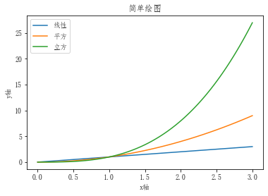
x = np.linspace(0,3,100)# 绘制三条线
plt.plot(x,x,label='线性')
plt.plot(x,x**2,label='平方')
plt.plot(x,x**3,label='立方')# 设置x轴和y轴名称
plt.xlabel('x轴')
plt.ylabel('y轴')# 设置标题名称
plt.title('简单绘图')# 显示legend
plt.legend()
plt.show()
Out[1]:
多子图
In[1]:
import numpy as np
import matplotlib.pyplot as plt
第一种方式
In [2]:
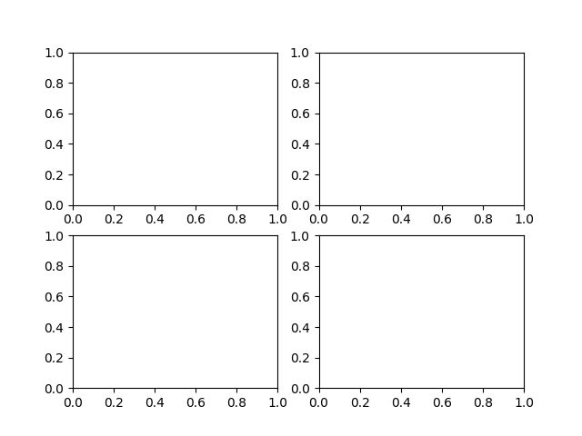
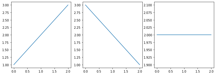
fig = plt.figure(figsize=(12,4)) # figsize 用来设置图的大小
ax1 = fig.add_subplot(1,3,1) # 添加子图,参数含义为位置(x,y)以及第几张图
ax2 = fig.add_subplot(1,3,2)
ax3 = fig.add_subplot(1,3,3)ax1.plot([1,2,3])
ax2.plot([3,2,1])
ax3.plot([2,2,2])plt.show()

In [3]:
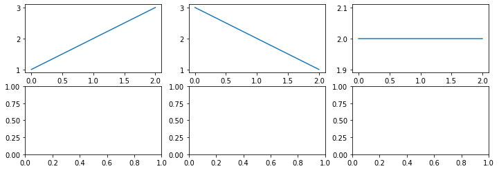
fig = plt.figure(figsize=(12,4)) # figsize 用来设置图的大小
ax1 = fig.add_subplot(1,3,2)     # 添加子图,参数含义为位置(x,y)# 以及第几张图即图的位置以及顺序
ax2 = fig.add_subplot(1,3,3)
ax3 = fig.add_subplot(1,3,1)ax1.plot([1,2,3])
ax2.plot([3,2,1])
ax3.plot([2,2,2])plt.show()
第二种方式
In [4]:
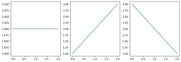
fig2,axes= plt.subplots(1,3,figsize=(12,4))axes[0].plot([1,2,3]) # 通过axes数组直接进行分部图形位置
axes[1].plot([3,2,1])
axes[2].plot([2,2,2])plt.show()
- 如果axes是多维对象,则需要传入多个坐标
In [5]:
fig3,axes = plt.subplots(2,3,figsize=(12,4)) # 创建一个2x3的图布axes[0,0].plot([1,2,3]) # 传入数值,进行绘画
axes[0,1].plot([3,2,1])
axes[0,2].plot([2,2,2])plt.show()
第三种方式
由于不推荐,就不进行学习了
线形图
matplotlib.pyplot.plot(*args, scalex=True, scaley=True, data=None, kwargs)
传数据的两种方式
In[1]:
matplotlib.pyplot.plot(*args, scalex=True, scaley=True, data=None, kwargs)
In [2]:
import matplotlib.pyplot as plt
fig,axes = plt.subplots()axes.plot([1,2,3,4])plt.show()
In [3]:
figure,axes = plt.subplots()data = {'a':[1,2,3],'b':[3,2,1]
}axes.plot('a','b',data=data)plt.show()
绘制多条线
In [4]:
figure,axes = plt.subplots()data = {'a':[1,2,3],'b':[3,2,1]
}axes.plot('a','b',data=data)
axes.plot([1,2,3,4])plt.show()
其他设置
1.颜色设置--color
可选值: 'b' blue 'g' green 'r' red 'c' cyan 'm' magenta 'y' yellow 'k' black 'w' white
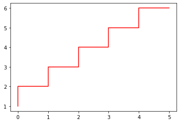
In [5]:
figure,axes = plt.subplots()axes.plot([1,2,3,4,5,6],color='r',drawstyle='steps')plt.show()
2.线性设置--linestyle
可选值:['solid' | 'dashed', 'dashdot', 'dotted' | (offset, on-off-dash-seq) | '-' | '--' | '-.' | ':' | 'None' | ' ' | '']
In [6]:
figure,axes = plt.subplots()axes.plot([1,2,3,4,5,6],linestyle='-.')plt.show()
3.drawstyle
可选值:['default' | 'steps' | 'steps-pre' | 'steps-mid' | 'steps-post']
In [7]:
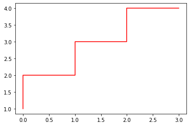
figure,axes = plt.subplots()axes.plot([1,2,3,4],color='r',drawstyle='steps')plt.show()
4.标记--marker
可选值:'.' point marker ',' pixel marker 'o' circle marker 'v' triangle_down marker'^' triangle_up marker'<' triangle_left marker '>' triangle_right marker '1' tri_down marker'2' tri_up marker '3' tri_left marker '4' tri_right marker's' square marker 'p' pentagon marker '*' star marker'h' hexagon1 marker 'H' hexagon2 marker '+' plus marker 'x' x marker 'D' diamond marker 'd' thindiamond marker '|' vline marker ``''`` hline marker
In [8]:
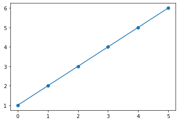
figure,axes = plt.subplots()axes.plot([1,2,3,4,5,6],marker='o')plt.show()
坐标轴刻度
In [1]:
import numpy as np
import matplotlib.pyplot as plt
设置坐标轴上下限
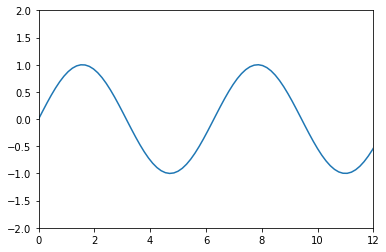
In [2]:
x = np.linspace(0,15,100)plt.plot(x,np.sin(x))
plt.xlim(0,12) # x轴刻度
plt.ylim(-2,2) # y轴刻度plt.show()
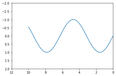
- 坐标轴设置为倒序
In [3]:
x = np.linspace(0,10,100)plt.plot(x,np.sin(x))
plt.xlim(12,0)
plt.ylim(2,-2)plt.show()
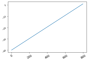
自定义刻度
In [4]:
plt.plot(np.linspace(-40,1,800))# 设置x轴与y轴的刻度,rotation为旋转的度数,fontsize为字体的大小plt.xticks([0,200,400,600,800],rotation=30 ,fontsize='large')
plt.yticks([-40,-30,-20,-10,0],rotation=30,fontsize='small')
Out[4]:
([<matplotlib.axis.YTick at 0x2997d645508>,<matplotlib.axis.YTick at 0x2997d644b88>,<matplotlib.axis.YTick at 0x2997d63f8c8>,<matplotlib.axis.YTick at 0x2997d66b988>,<matplotlib.axis.YTick at 0x2997d667308>],<a list of 5 Text yticklabel objects>)
标题、轴标签以及图例
演示
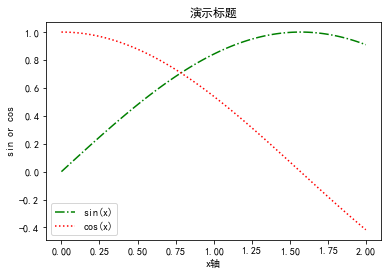
In [1]:
import numpy as np
import matplotlib.pyplot as pltplt.rcParams['font.sans-serif'] = ['SimHei']  # 用来正常显示中文
plt.rcParams['axes.unicode_minus'] = False  # 用来正常显示负号
In [2]:
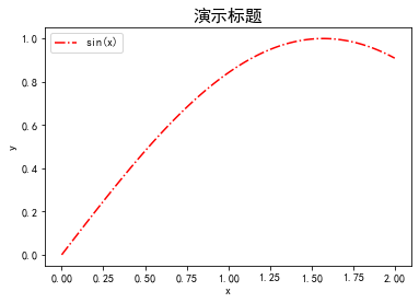
x = np.linspace(0,2,100)plt.plot(x,np.sin(x),'-.g',label='sin(x)')
plt.plot(x,np.cos(x),':r',label='cos(x)')plt.title("演示标题")
plt.xlabel('x轴')
plt.ylabel('sin or cos')plt.legend()
Out[2]:
<matplotlib.legend.Legend at 0x1c2b8dc1dc8>
设置标题--title
fontsize:字体大小,默认12,也可以使用xx-small....字符串系列fontweight:字体粗细,或者'light'、'normal'、'medium'、'semibold'、'bold'、'heavy'、'black'。fontstyle: 字体类型,或者'normal'、'italic'、'oblique'。verticalalignment:垂直对齐方式 ,或者'center'、'top'、'bottom'、'baseline'horizontalalignment:水平对齐方式,可选参数:‘left’、‘right’、‘center’rotation:旋转角度alpha: 透明度,参数值0至1之间backgroundcolor: 背景颜色bbox:给标题增加外框 ,常用参数如下:boxstyle:方框外形facecolor:(简写fc)背景颜色edgecolor:(简写ec)边框线条颜色edgewidth:边框线条大小
In [3]:
x = np.linspace(0,2,100)plt.plot(x,np.sin(x),'-.r',label='sin(x)')plt.title('演示标题',fontsize=16,fontweight='heavy')plt.xlabel('x')
plt.ylabel('y')plt.legend()
Out[3]:
<matplotlib.legend.Legend at 0x1c2b8e8ea48>
设置图例
loc:图例的位置,参数值分别为1,2,3,4代表四个方向
prop:字体参数
fontsize:字体大小
markerscale:图例标记与原始标记的相对大小
markerfirst:如果为True,则图例标记位于图例标签的左侧
numpoints:为线条图图例条目创建的标记点数
scatterpoints:为散点图图例条目创建的标记点数
scatteryoffsets:为散点图图例条目创建的标记的垂直偏移量
frameon:是否显示图例边框
fancybox:边框四个角是否有弧度
shadow:控制是否在图例后面画一个阴影
framealpha:图例边框的透明度
edgecolor:边框颜色
facecolor:背景色
ncol:设置图例分为n列展示
borderpad:图例边框的内边距
labelspacing:图例条目之间的垂直间距
handlelength:图例句柄的长度
handleheight:图例句柄的高度
handletextpad:图例句柄和文本之间的间距
borderaxespad:轴与图例边框之间的距离
columnspacing:列间距
title:图例的标题
In [4]:
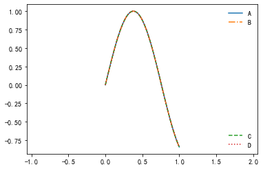
lines = []
styles = ['-','-.','--',':']
x = np.linspace(0,1,100)for i in range(4):lines += plt.plot(x,np.sin(x+np.pi*x),styles[i])
plt.axis('equal')# 生成第一个图例
leg = plt.legend(lines[:2],['A','B'],loc=1,frameon=False)# 生成第二个图例,但是第一个图例会被抹去
plt.legend(lines[2:],['C','D'],loc=4,frameon=False)# gca方法获取当前坐标轴,再使用它的`add_artist`方法将第一个图例重新画上去
plt.gca().add_artist(leg)
Out[4]:
<matplotlib.legend.Legend at 0x1c2b8e8ee08>

文本、箭头和注释
演示
In [1]:
import numpy as np
import matplotlib.pyplot as pltplt.rcParams['font.sans-serif'] = ['SimHei']  # 用来正常显示中文
plt.rcParams['axes.unicode_minus'] = False  # 用来正常显示负号
In [2]:
x = np.linspace(0,2,100)plt.plot(x,np.sin(x),'-.g',label='sin(x)')
plt.plot(x,np.cos(x),':r',label='cos(x)')plt.title("演示标题")
plt.xlabel('x轴')
plt.ylabel('sin or cos')plt.legend()
Out[2]:
<matplotlib.legend.Legend at 0x21b4eff5208>

设置标题--title
fontsize:字体大小,默认12,也可以使用xx-small....字符串系列fontweight:字体粗细,或者'light'、'normal'、'medium'、'semibold'、'bold'、'heavy'、'black'。fontstyle: 字体类型,或者'normal'、'italic'、'oblique'。verticalalignment:垂直对齐方式 ,或者'center'、'top'、'bottom'、'baseline'horizontalalignment:水平对齐方式,可选参数:‘left’、‘right’、‘center’rotation:旋转角度alpha: 透明度,参数值0至1之间backgroundcolor: 背景颜色bbox:给标题增加外框 ,常用参数如下:boxstyle:方框外形facecolor:(简写fc)背景颜色edgecolor:(简写ec)边框线条颜色edgewidth:边框线条大小
In [3]:
x = np.linspace(0,2,100)plt.plot(x,np.sin(x),'-.r',label='sin(x)')plt.title('演示标题',fontsize=16,fontweight='heavy')plt.xlabel('x')
plt.ylabel('y')plt.legend()
Out[3]:
<matplotlib.legend.Legend at 0x21b4f7b0908>

设置图例
loc:图例的位置,参数值分别为1,2,3,4代表四个方向
prop:字体参数
fontsize:字体大小
markerscale:图例标记与原始标记的相对大小
markerfirst:如果为True,则图例标记位于图例标签的左侧
numpoints:为线条图图例条目创建的标记点数
scatterpoints:为散点图图例条目创建的标记点数
scatteryoffsets:为散点图图例条目创建的标记的垂直偏移量
frameon:是否显示图例边框
fancybox:边框四个角是否有弧度
shadow:控制是否在图例后面画一个阴影
framealpha:图例边框的透明度
edgecolor:边框颜色
facecolor:背景色
ncol:设置图例分为n列展示
borderpad:图例边框的内边距
labelspacing:图例条目之间的垂直间距
handlelength:图例句柄的长度
handleheight:图例句柄的高度
handletextpad:图例句柄和文本之间的间距
borderaxespad:轴与图例边框之间的距离
columnspacing:列间距
title:图例的标题
In [4]:
lines = []
styles = ['-','-.','--',':']
x = np.linspace(0,1,100)for i in range(4):lines += plt.plot(x,np.sin(x+np.pi*x),styles[i])
plt.axis('equal')# 生成第一个图例
leg = plt.legend(lines[:2],['A','B'],loc=1,frameon=False)# 生成第二个图例,但是第一个图例会被抹去
plt.legend(lines[2:],['C','D'],loc=4,frameon=False)# gca方法获取当前坐标轴,再使用它的`add_artist`方法将第一个图例重新画上去
plt.gca().add_artist(leg)
Out[4]:
<matplotlib.legend.Legend at 0x21b4f850f88>
文本
class matplotlib.text.Annotation(text, xy, xytext=None, xycoords='data', textcoords=None, arrowprops=None, annotation_clip=None, kwargs)
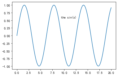
In [5]:
x = np.linspace(0,20,100)
plt.plot(x,np.sin(x))
# 11和0.6表示文本出现的(x,y)位置,ha以及va分别为水平和垂直方向
plt.text(11,0.6,'the sin(x)',ha='center',va='center')
Out[5]:
Text(11, 0.6, 'the sin(x)')
箭头和注释
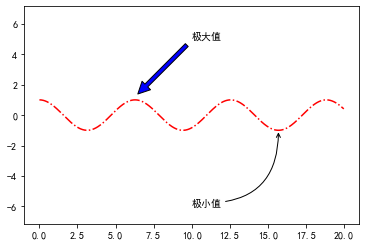
matplotlib.pyplot.annotate(s, xy, *args, kwargs)主要参数:s:注释文本内容xy:被注释对象的坐标位置,实际上就是图中箭头的箭锋位置xytext: 具体注释文字的坐标位置xycoords:被注释对象使用的参考坐标系extcoords:注释文字的偏移量arrowprops:可选,增加注释箭头width:箭头宽度,以点为单位frac:箭头头部所占据的比例headwidth:箭头底部的宽度,以点为单位shrink:移动提示,并使其离注释点和文本一些距离
In [6]:
figure,axes = plt.subplots()x = np.linspace(0,20,1000)
axes.plot(x,np.cos(x),'-.r')
axes.axis('equal')# facecolor参数修改箭头颜色,shrink参数越小箭头长度越长axes.annotate('极大值',xy=(6.28,1.2),xytext=(10,5),arrowprops=dict(facecolor='blue',shrink=0.05))# arrowstyle指定箭头形状
axes.annotate('极小值',xy=(5*np.pi,-1),xytext=(10,-6),arrowprops=dict(arrowstyle='->',connectionstyle='angle3,angleA=0,angleB=-90'))
Out[6]:
Text(10, -6, '极小值')
条形图
In [1]:
import numpy as np
from matplotlib import pyplot as plt
from pylab import mplmpl.rcParams['font.sans-serif'] = ['FangSong'] # 指定默认字体
mpl.rcParams['axes.unicode_minus'] = False # 解决保存图像是负号'-'显示为方块的问题
matplotlib.pyplot.bar(x, height, width=0.8, bottom=None, *, align='center', data=None, kwargs)主要参数说明:x:x坐标。int,floatheight:条形的高度。int,floatwidth:宽度。0~1,默认0.8botton:条形的起始位置,也是y轴的起始坐标align:条形的中心位置。“center”,"lege"边缘color:条形的颜色。“r","b","g","#123465",默认“b"edgecolor:边框的颜色。同上linewidth:边框的宽度。像素,默认无,inttick_label:下标的标签。可以是元组类型的字符组合log:y轴使用科学计算法表示。boolorientation:是竖直条还是水平条。竖直:"vertical",水平条:"horizontal"
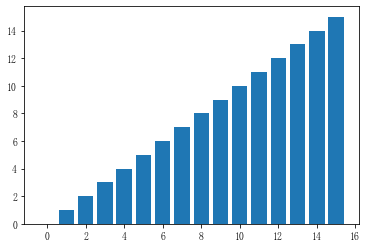
In [2]:
y = range(0,16)
x = np.arange(16)plt.bar(x,y)
plt.show()
In [3]:
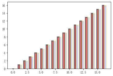
y = range(0,17)
x = np.arange(17)plt.bar(x,y,alpha=0.5,width=0.3,color='red',edgecolor='black',label='条形图1',lw=3)
plt.bar(x+0.4,y,alpha=0.2,width=0.3,color='blue',edgecolor='yellow',label='条形图2',lw=3)
plt.show()
In [4]:
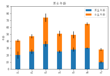
M = 7age1 = [20,25,36,25,28,30,10]
age2 = [21,22,38,26,21,35,18]age1_std = [5,3,4,2,3,1,2]
age2_std = [2,3,6,4,5,2,2]x = np.arange(M)width = 0.35p1 = plt.bar(x, age1, width, yerr=age1_std)
p2 = plt.bar(x, age2, width,bottom=age1, yerr=age2_std) # p2条形图位于p1条形图的上方plt.ylabel('年龄')
plt.title('男女年龄')
plt.xticks(x,['a1','a2','a3','a4','a5','a6','a7'])
plt.yticks(np.arange(0,100,10))plt.legend((p1[0],p2[0]),('男生年龄','女生年龄'))
plt.show()
直方图
matplotlib.pyplot.hist(x, bins=None, range=None, density=None, weights=None, cumulative=False, bottom=None, histtype='bar', align='mid', orientation='vertical', rwidth=None, log=False, color=None, label=None, stacked=False, normed=None, *, data=None, kwargs)主要参数:x:数据集,最终的直方图将对数据集进行统计bins:统计的区间分布range:tuple, 显示的区间,测试发现添加range并没有达到想要的效果,即显示指定区间统计结果,如果有小伙伴知道,欢迎评论,谢谢density:bool,默认为false,显示的是频数统计结果,为True则显示频率统计结果,这里需要注意,频率统计结果=区间数目/(总数*区间宽度),和normed效果一致,官方推荐使用densityhisttype:可选{'bar', 'barstacked', 'step', 'stepfilled'}之一,默认为bar,推荐使用默认配置,step使用的是梯状,stepfilled则会对梯状内部进行填充,效果与bar类似align:可选{'left', 'mid', 'right'}之一,默认为'mid',控制柱状图的水平分布,left或者right,会有部分空白区域,推荐使用默认log:bool,默认False,即y坐标轴是否选择指数刻度stacked:bool,默认为False,是否为堆积状图
In [5]:
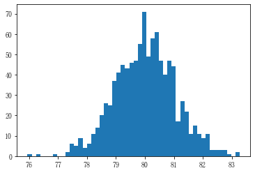
mu = 3
sigma = 0.1
number = 1000
x = np.random.normal(mu,sigma,number)*10+50plt.hist(x,50)
plt.show()
In [6]:
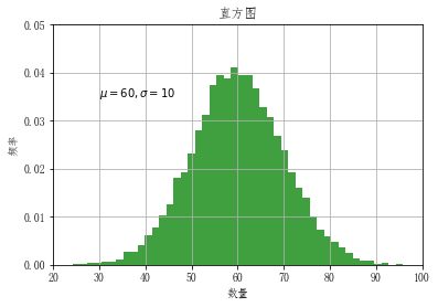
mu, sigma = 60,10
x = mu + sigma * np.random.randn(10000)plt.hist(x, 50, density=True, facecolor='g', alpha=0.75)plt.xlabel('数量')
plt.ylabel('频率')
plt.title('直方图')
plt.text(30, .035, r'$\mu={} ,\sigma={}$'.format(mu,sigma))# 修改x,y刻度范围
plt.ylim(0,0.05)
plt.xlim(20,100)plt.grid(True)
plt.show()
饼图
matplotlib.pyplot.pie(x, explode=None, labels=None, colors=None, autopct=None, pctdistance=0.6, shadow=False, labeldistance=1.1, startangle=None, radius=None, counterclock=True, wedgeprops=None, textprops=None, center=(0, 0), frame=False, rotatelabels=False, *, data=None)主要参数:x :(每一块)的比例,如果sum(x) > 1会使用sum(x)归一化;labels:(每一块)饼图外侧显示的说明文字;explode:(每一块)离开中心距离;startangle:起始绘制角度,默认图是从x轴正方向逆时针画起,如设定=90则从y轴正方向画起;shadow:在饼图下面画一个阴影。默认值:False,即不画阴影;labeldistance:label标记的绘制位置,相对于半径的比例,默认值为1.1, 如<1则绘制在饼图内侧;autopct:控制饼图内百分比设置,可以使用format字符串或者format function,'%1.1f'指小数点前后位数(没有用空格补齐);pctdistance:类似于labeldistance,指定autopct的位置刻度,默认值为0.6;radius:控制饼图半径,默认值为1;counterclock:指定指针方向;布尔值,可选参数,默认为:True,即逆时针。将值改为False即可改为顺时针。wedgeprops :字典类型,可选参数,默认值:None。参数字典传递给wedge对象用来画一个饼图。例如:wedgeprops={'linewidth':3}设置wedge线宽为3。textprops:设置标签(labels)和比例文字的格式;字典类型,可选参数,默认值为:None。传递给text对象的字典参数。center:浮点类型的列表,可选参数,默认值:(0,0)。图标中心位置。frame:布尔类型,可选参数,默认值:False。如果是true,绘制带有表的轴框架。rotatelabels:布尔类型,可选参数,默认为:False。如果为True,旋转每个label到指定的角度。
In [7]:
x = [10,20,30,40,50]plt.pie(x)
plt.show()

In [8]:
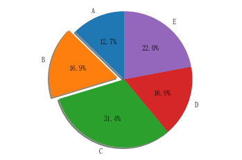
# 图表,将按照逆时针顺序排序labels = ['A','B','C','D','E']
x = [15,20,37,20,26]
explode = [0,0.1,0,0,0] # 饼图中B区域会脱离与其他区域figure,axes = plt.subplots()
# shadow:阴影
# statangle;起始绘制角度
# explode:(每一块)离开中心距离
# autopct:区域所占百分比
axes.pie(x,explode=explode,labels=labels,autopct='%1.1f%%',shadow=True,startangle=90)
# 长宽比相等可确保将饼图绘制为圆形
axes.axis('equal')plt.show()
散点图
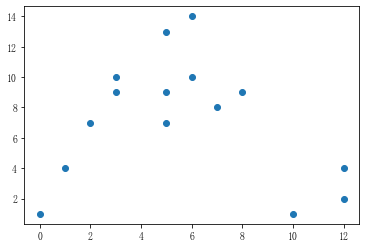
主要参数说明:x,y:输入数据s:标记大小,以像素为单位color:颜色marker:标记alpha:透明度linewidths:线宽edgecolors :边界颜色
In [9]:
x = np.random.randint(0,15,15)
y = np.random.randint(0,15,15)
plt.scatter(x,y)
Out[9]:
<matplotlib.collections.PathCollection at 0x1937af97948>
In [10]:
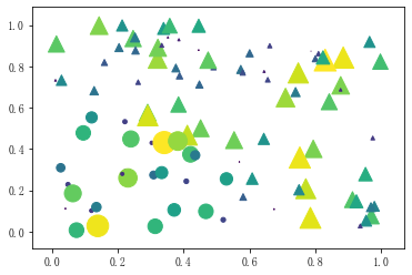
number = 100r0 = 0.6
x = np.random.rand(number)
y = np.random.rand(number)
area = (20*np.random.rand(number))**2
c = np.sqrt(area)
r = np.sqrt(x**2+y**2)
# 满足条件时mask返回True,否则返回False,即被masked的区间为True
area1 = np.ma.masked_where(r < r0,area)
area2 = np.ma.masked_where(r >= r0,area)plt.scatter(x,y,s=area1,marker='^',c=c)
plt.scatter(x,y,s=area2,marker='o',c=c)plt.show()
箱线图
matplotlib.pyplot.boxplot(x, notch=None, sym=None, vert=None, whis=None, positions=None, widths=None, patch_artist=None, bootstrap=None, usermedians=None, conf_intervals=None, meanline=None, showmeans=None, showcaps=None, showbox=None, showfliers=None, boxprops=None, labels=None, flierprops=None, medianprops=None, meanprops=None, capprops=None, whiskerprops=None, manage_ticks=True, autorange=False, zorder=None, *, data=None)主要参数:x:指定要绘制箱线图的数据notch:是否是凹口的形式展现箱线图,默认非凹口sym:指定异常点的形状,默认为+号显示vert:是否需要将箱线图垂直摆放,默认垂直摆放whis:指定上下须与上下四分位的距离,默认为1.5倍的四分位差positions:指定箱线图的位置,默认为[0,1,2…]widths:指定箱线图的宽度,默认为0.5patch_artist:是否填充箱体的颜色meanline:是否用线的形式表示均值,默认用点来表示showmeans:是否显示均值,默认不显示showcaps:是否显示箱线图顶端和末端的两条线,默认显示showbox:是否显示箱线图的箱体,默认显示showfliers:是否显示异常值,默认显示boxprops:设置箱体的属性,如边框色,填充色等labels:为箱线图添加标签,类似于图例的作用filerprops:设置异常值的属性,如异常点的形状、大小、填充色等medianprops:设置中位数的属性,如线的类型、粗细等meanprops:设置均值的属性,如点的大小、颜色等capprops:设置箱线图顶端和末端线条的属性,如颜色、粗细等whiskerprops:设置须的属性,如颜色、粗细、线的类型等
In [11]:
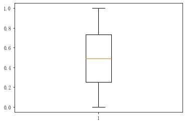
x = np.random.rand(1000)plt.boxplot(x)
plt.show()
In [12]:
# 创建3个正态分布的一维数组
data = [np.random.normal(0,std,100) for std in range(1,4)]
labels = ['x1','x2','x3']fig,ax = plt.subplots(nrows=1,ncols=2,figsize=(9,4))# 矩形箱图"""
vert:是否垂直
patch_artist:是否填充箱体的颜色
"""
boxplot1 = ax[0].boxplot(data,vert=True,patch_artist=True,labels=labels)
ax[0].set_title('矩形箱图')# 缺口形状箱形图
"""
notch:是否是凹口的形式展现箱线图,默认非凹口
"""
boxplot2 = ax[1].boxplot(data,notch=True,vert=True,patch_artist=True,labels=labels)
ax[1].set_title('缺口形状箱形图')# 填充颜色
colors = ['red','pink','lightgreen']
for bp in (boxplot1,boxplot2):for patch,color in zip(bp['boxes'],colors):patch.set_facecolor(color)# 添加水平网格线
for a in ax:a.yaxis.grid(True)a.set_xlabel('三个样本')a.set_ylabel('样本值')plt.show()
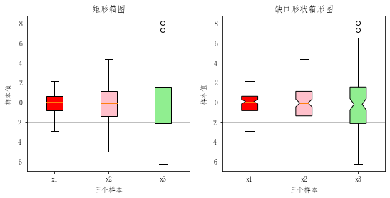
箱形图最大的优点就是不受异常值的影响,能够准确稳定地描绘出数据的离散分布情况,同时也利于数据的清洗